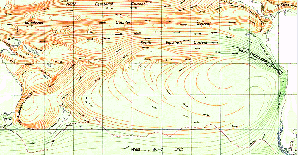
I really have a problem with the level of sophistication and detail (or lack of therein) surrounding the ‘science’ of human-driven global warming (a.k.a. Anthropogenic Global Warming (AGW)). Unlike other areas of applied science, the theories and claims behind AGW are so abstract as to have little resemblance to reality.
For example, the typical energy balance models for how the Sun warms and the Earth responds are based on fictional simplistic models. See here for a great discussion of how the black/grey body model of energy absorption and radiation are embedded in ALL current calculations of the Earth’s Energy Balance. Here’s a snippet (click to enlarge figure):

In Note 4 on the diagram, it is said that the longwave infrared radiation is emitted from the surface of the Earth due to the 168 W/m^2 of radiation from the sun that the surface has absorbed. In Note 5, it states that some of this radiation is absorbed by greenhouse gas molecules with half being emitted in the direction of space and half emitted back toward the Earth’s surface. The infrared radiation from the greenhouse gas emission toward the surface is absorbed and the surface gains more heat. This additional heat causes more infrared radiation to be emitted, which again is absorbed by greenhouse gas molecules and half again is re-emitted toward the surface heating it still more.
This is very important in the greenhouse theory because the Earth’s surface is desperately cold due to direct solar heating, since the black body temperature corresponding to a thermal power of 168 W/m^2 is only 233.3 K or -39.8 C.
Emphasis mine. Note what I have highlighted in Long Wavelength (LW) red text. The simplistic model assumes some of the LW radiation is captured and half reflected back to Earth. Why half? Where did this number come from?
And note how the amount of energy radiated is based on a mythical black body model. We shall see this is not even close to reality. If you understand black/grey body physics you know no such thing exists on a planetary or solar scale that we know of. A key assumption behind black/grey body models is their surface is homogenous and static. In other words it is always the same and fixed. A baseless assumption.
Interestingly, NASA and NOAA just launched a satellite that was commissioned to bolster Al Gore’s alarmist claims of runaway global heating. It is 6 years late in getting on 0rbit, ridiculously over budget and is still working through its commissioning phase so it can move into an operational state. Yet the NPP Soumi satellite has already captured some amazing data – and it completely destroys the IPCC’s basic models of energy balance.
Here are the two first images from the NPP CERES instrument, the latest in a long line of CERES payloads that have looked at the long wavelength (LW) radiative and short wavelength (SW) reflective radiation from the Earth. SW energy is energy that never makes it to the Earth because it bounces off the clouds in the atmosphere.
So let’s look at CERES first images, beginning with the short wavelength (SW) data (click to enlarge):

Note the light-blue ‘hot spots’. This is where clouds are reflecting back the Sun’s energy, reducing how much solar energy goes into the Earth’s energy budget. Dark blue is the actual region of full solar radiation coming in. Moreover, this is one day with one pattern of clouds – a day where the region over Australia and the southwest pacific are covered and the southeast pacific is wide open. Each day this pattern is unique. What is the average? No one knows – especially the IPCC. However, 10 years of this kind of data would give us some good boundaries for how much energy is actually incoming on any day.
Now let’s look at the companion long wavelength (LW) image from the same cycle:

Note how those same openings in the clouds where solar radiance can reach the surface are ALSO the places where LW radiation is free to radiate back out (bright red). This can be seen by overlaying the two images:
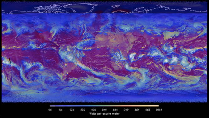
So in places where there is minimal reflectivity of incoming energy from clouds there is also maximum radiance back out to space. A natural balance.
Also note those places were there is maximum reflectivity (bright light blue), there is minimal radiance in LW (i.e, the green house effect). Again, an equilibrium state appears to be called for here.
Finally, note how the land radiates back more LW than the oceans, which are a heat sink and probably are absorbing and dispersing the energy not radiated back to space.
It is clear the ‘captured’ solar energy reflected back is NOT 50% radiated LW. Where there is maximum SW incoming radiation there is also maximum LW outbound radiation. Where there is minimum incoming SW, there is minimum radiation in LW. As far as I can tell the IPCC energy balance model is completely inadequate. But there is more.
The area of outgoing radiation (red) is global – there is always radiance coming off the land and oceans. But the energy coming into the system is limited to the sun pointing side – in addition to those areas where low cloud density allows the energy through. In the following diagram I lay over a snapshot of the Solar Energy flux at any given instance of time, per solar radiance intensity based on sun angle inclination (see here for where the zones of intensity come from).
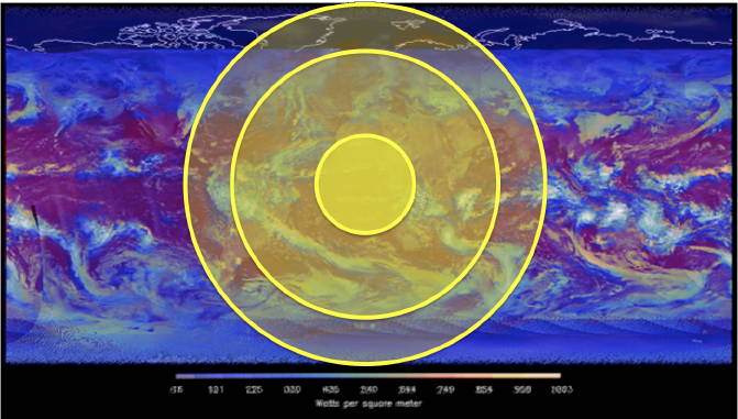
Around the equator (or where the Sun is directly overhead at noon) the full intensity ‘cone’ is smaller than some might expect. This the area of maximum incoming solar energy, which then is partially reflected by the clouds existing at that time. If this circle was over Australia this would impart a significant reduction in incoming energy.
The middle ring is roughly (not measured to precision) the point where the solar radiation drops by half. This can be seen in the following basic geometry for solar incidence angle:

So at the middle circle’s outer boundary not only are clouds reflecting much of the energy, but the amount of energy reaching the surface is cut way down. At the outer circle boundary we have the night-terminus. This is where incoming energy is zero.
Soooo.
A minimally accurate energy balance model would capture the zones of incoming radiation based on solar angle, then attenuated by the cloud cover reflecting the incoming SW. This is the input side of the equation and it is not black/grey body model. The outgoing side is a full sphere, but again attenuated by the cloud cover. It also is not a black/grey body.
June 2014 Update: To be clear on why the energy absorbed by the Earth cannot be modeled using a black body:
A black body is an idealized physical body that absorbs all incident electromagnetic radiation, regardless of frequency or angle of incidence.
Given the physics of the Sun-Earth energy transfer, the Sun’s energy a point source on a vector onto the surface of a sphere which is THEN further attenuated by cloud cover and what form of surface (land or see) that is receiving the energy that gets past the clouds. – end update
In my mind, the energy balance equations to date are as fictional as modeling a rifled bullet at 2,000 yards using an iron ball (e.g., musket ball) model with a specific initial velocity – while ignoring wind, temperature and humidity. You can bound a sniper round’s path using simplistic Newtonian physics on a mass of iron with specific initial velocity and constant gravity, but you cannot predict the actual path because this model is too ignorant of reality. There is a complete lack of precision in the iron ball model.
This is why the claimed precision by the IPCC is such a joke. Their models are so simplistic they are fictional. And this is why engineers do the actual application of science to the real world and rarely scientists alone. Theory is interesting, but to apply it is much more than running shoddy statistics through unproven computer models. It requires much, much more than the IPCC has shown the capability to do.
Tags: Black Body, Energy Balance, Global Warming, Grey Body, IPCC, LW Radiation, SW Reflectivity