Jul 17 2009
Validate The Global Warming Alarmists Data First!
Over at Watt’s Up With That (WUWT) I have been commenting on how the NOAA-GISS temperature data set is all bass ackwards. I have been noting that scientifically and statistically the data sets used to claim warming are actually the use of thousands of uncalibrated, unmonitored sensors of different types (and therefore different performance and precision) from ground sensors to overwrite the satellite data which shows no significant warming in 3 decades. I am going to just copy my comments here, but suggest folks head over and keep up with the debate.
First comment:
The truth? The truth is the alarmists have been smearing bad ground based data over more precise and temporally linked satellite data to obscure the cooling. It’s easy to do statistically as I show in this post:
http://strata-sphere.com/blog/index.php/archives/9852
The point is a satellite operating for 3-6 years uses a single, calibrated and verifiable sensor to cover the globe making thousands of measurement points. A single sensor which can be checked against ground sensors which only measure the temperature for a distance of a few feet at best.
When you compare this measurement system in space to the compounding errors from thousands of uncalibrated, unverified, lower precision sensors spread thinly across the Earth’s surface it is clear what is going on. Ground based sensors cannot produce a global measurement with any accuracy under a degree if the error budget was being done correctly. Each sensor has an unmeasured error, which combines to create a huge error in ‘global temperature’.
A satellite sensor has a fixed error source that can be calibrated (self checked) many ways. There is only one error source, not thousands.
I mean, does anyone still do basic math anymore?
Second comment:
Manfred and Cary,
you ask how good NOAA’s global data be worse than local data in Australia and elsewhere? It is simple (and trust me, I work for NASA and this is not beyond the pale). They averaged it (or smeared it) with other data to raise it up. They can rationalize why they need to over ride or lower the weighting of the cooler data. They just need to agree on some lame excuse to dilute good measurements with bad.
These people do not care. Their jobs are now tied to the alarmists, and in this economy people will do anything to have or keep a job.
Do you really think the Shuttle accidents were not caused by higher ups telling people lower down to be quiet or they can be replaced? If we government can let little tin dictators destroy two shuttles, what makes you think the properly placed idiots can’t screw up some simple math with their own agenda?
Seriously. The way to fight back is to run scenarios with the same data that takes out the smearing. Make the assumption the satellite data is solid and that the ground based sensors are only there to do local validation of the sat data. What is the answer when we process the data with these assumptions, where we don’t ‘fill in’ holes by averaging the two sets?
What does the last 3 decades look like under these assumptions. Show a range of assumptions and how they change the processing methodologies and weights and produce a range of answers.
BTW, there is no way June was the 15th warmest for the last 31 years and the 9th warmest over the last 129. Just not possible. If your math comes up with that result – it is wrong! I don’t care how you average it. That’s not the point. Instead of thinking about data sets with errors think about having perfect knowledge and running numbers. That can’t happen with perfect knowledge. Either June 2009 is 8th, 15th or higher (if there were some warms spikes before the 31 recent years).
What the data tells me, when you get two numbers like this is the math is wrong. It could be the way the averaging is being done, but it is more likely it is how the measurement error is being handled.
As I said before, Sat data is many orders of magnitude more consistent than a bunch of sparse surface based sensors. If the surface sensors can’t produce the same results as the satellite, it ain’t the satellite that has the source of errors.
Third comment:
If you want to remove the ground station mess from the satellite data you begin with just the satellite data itself. The challenge there is how to handle the change over from one satellite to another, and the aging (drift) if the sensor.
My proposal would be to identify 3-6 well documented ground stations around the globe which have good performance and span all 31 years of the satellites. These are the statistical anchor points for the satellite drift and transitions. If, on average, these 6 stations indicate a life time change in Sat1’s sensor from +.5°C to +1.1°C we can adjust for sensor aging. If the same 6 stations detect Sat2’s bias dropping to +.3°C when it took over for Sat1 we can not only adjust for drift but transition.
The key is to only use a small number of ground reference points so you don’t add mountains of sensor errors from the ground.
Once you compute a satellite only plot for the last 31 years, then you can not only compare to NOAA and GISS, you can estimate their errors and biases – even regionally. You can show how each surface sensor performed against the satellites (one Sat or across satellite)
Turn the tables, use the satellites to question the ground sensor errors and calibration. It is, in fact, the proper method scientifically and statistically. Single spacecraft sensor with known and measured performance is the only way to check the performance of thousands of independent sensors with varying precision and health.
When you do this, the NOAA-GISS anomalies are no longer global warming, but data showing how bad the ground sensors are performing! Which is the how this should have been computed in the first place.
In my mind the last comment is probably the most critical. To assess the performance of a network of sensors you use a single test source. In this case we have satellites that cover the globe and right now can be used to assess the performance of all these surface sensors. I would bet that a majority of the sensors NOAA-GISS rely on have a record of poor performance, which will be evident if we look at their measurements compared to satellite data taken concurrently in the region.
I would not be at all surprised if we learn global warming really is nothing more than a “bad data” phantom from a hodgepodge of aging and error prone surface sensors. That would be human created warming all right.
Update: More here on the difference between data sets. The one important chart (click to enlarge) to note is this one showing the difference between raw measurements and the ‘processed’ result – clearly showing the warming of the late 1990’s was something ADDED to the raw data!
 Â
Â
Even better is this chart which shows the Hansen-GISS predictions from when he first turned into a Green Chicken Little and the UN/IPCC started selling snake oil, and what actually happened:
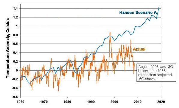
Proof positive the climate models are wrong and a pile of junk code. If this was any other area of science or engineering these people would have lost the careers as all their credibility disappeared.


In addition to sensor drift there is also drift in the position of the satellite’s orbit that needs to be taken into account. The satellite is in polar orbit. That means on every orbit it makes one pass over the daylight side, over the pole, down the night side, and over the opposite pole.
Now imagine that the satellite is making its daylight pass at “11 am” solar time … one hour before the sun is highest in the sky. Now imagine that orbit is drifting ever so slightly to the west on the daylight side. As it drifts, the temperatures it records are slightly warmer because they are being taken during a warmer part of the day (and on the night side, at a slightly cooler part of the night). At the end of the month this orbital drift (which is known with precision) is used to “adjust” the readings so that an apples to apples comparison can be made.
In Anthony’s recent article, he notes that the temperatures for this month have risen unexpectedly but buried in the comments you will see that this is probably due to orbital drift of the satellite taking measurements during a “warmer” period of the day and those measurements will not be compensated for that drift until the end of the month.
Well Hell CP, I assumed these measurements were corrected for the bloody TIME OF DAY they are recorded!
The fact is most LEO Polar Orbiters can cover the earth (their orbits precessing each day so that they circle back around to the start) in I think 7 days (depends on inclination and altitude). So if the satellite flies over head today it will be back over head in 7 days (but not at the exact same time of course).
Are these scientists or poseurs?
They are adjusted eventually, just not in real time. And that is primary reason that UAH and RSS differ. They both use the same input data but they do different algorithms for time of observation … what they call their diurnal adjustment. And while the readings differ slightly, they do track together in trend as can be seen in this graph. They track together well in trend though they do differ somewhat month to month due to the adjustments.
Now compare that with GISS or NCDC and you see a WHOPPING difference. The data that comes from NOAA is diverging steadily from the satellite data. GISS gets its data from NOAA (among other places).
The “surface” record is, as you point out, a joke. The “adjustments” are not custom to each measuring station and a “one size fits all” approach is used. All ground sensors are not off by the same amount.
Two things that are particularly annoying to me are the UAH adjustment and the polar temperatures used. If you have a station in a city that consistently reads 1-degree higher than the average of the surrounding rural stations, the data from the rural stations is adjusted UPWARDS to match the urban station rather than the urban station adjusted downwards. This skews everything upward.
GISS uses no direct observations of polar temperatures even though many are available on various US government buoys. Instead, GISS takes the output of what Hansen’s climate model says polar temperatures SHOULD be and plugs them in to GISSTEMP as if they were actual values.
So here you have positive feedback. The model says temps should be higher. The higher temps are plugged into GISSTEMP, GISSTEMP produces a higher global temperature which the model then takes even higher, which gets plugged back into GISSTEMP, etc. You are calibrating the model to its own output so any error get exaggerated. It is no wonder these models are walking temperatures up to oblivion.
It is just plain moronic, AJ. Sorry but I can find no better word for it.
CP, you are being too polite. I had no idea the feed back loop was all in the model runs. Higher models outputs go into the next run which produce higher outputs! Egads, hope these idiots don’t have to engineer anything safely.
And you are right about raising up the surrounding cooler data (I call it smearing the bad data over good, but same difference). If you were doing the math right the number of surrounding lower values would bring the outlier down – like a good Kalhman filter does.
In fact I am coming to the sad conclusion the math here is juvenile at best. We should be using a Kalhman filter like approach, where there is recent historical memory in the data which dissipates over months or years, and outliers get swamped out, not the larger number of similar values.
Basically this is either a convoluted lie are idiots who don’t have a clue what they are doing.
I’ve said all of this before. So?…
My biggest problem with global warming is the absolute certitude of some of its’ proponents (Example: Al Gore stating that “The science has been settled!”).
Let’s try for some perspective, time-wise.
For those comfortable with the metric (S.I.) system, imagine a line about 4.6 kilometers long (a bit under 3 miles). That would represent the 4.6 billion year age of the Earth at 1,000,000 years/meter; 1 mm (about the thickness of a paper clip) would represent a THOUSAND years.
That line would span the downtown area of quite a few large cities, with some to spare. Here in Houston, the downtown streets are 16 to the mile, making their spacing about 100 meters. Thus, that line would be about 46 blocks.
The reign of the dinosaurs ended around 65 million years ago (65 meters, about 2/3 of a city block down that line from today).
The first of our ancestors verging on intelligence may have emerged from 2 to 4 million years ago (2 to 4 meters, say 6.5 to 13 feet; your living room could be around 4 meters in one of its’ dimensions).
What we call “modern” man may go back 40,000 years or so (40 mm, TWO finger-widths on that line).
Written history goes back 6000 years (six millimeters, 1/4 inch on that line).
Fahrenheit’s thermometer is around 300 years old ( 0.3 mm, you’re approaching the thickness of a business card now, or the diameter of a grain of salt).
The portion of that time-line during which precise temperature measurements were recorded would be literally microscopic.
And from that portion, we dare to make really long range climate predictions, and mandate actions based on them?
Absolutely destroy our economy because of them?
I live about three miles west of some of Houston’s major downtown buildings, so I can easily visualize that line.
Looking at that time-line of Earth’s history (the universe’s may be four times that), and the flyspeck of our own existence upon it, the notion of asserting that ANY science has been “settled” strikes me as arrogance beyond comprehension (as in “only a politician could possibly believe that”).
–
AJ, Dr. Roy Spencer has a pretty good article on climate models at his blog. He doesn’t update it very often, maybe a few times a month, but it is always worth stopping by to see what is new.
AJ, Steve McIntyre also has an article on the UAH and RSS satellite data today on his blog.
[…] […]