Jul 15 2009
Source Of Man Made Warming Discovered!
Folks, after years of scientific measurement and debate we have determined global warming is indeed man made, and we have isolated the source for 100% of the man made global warming.
The reason it took years to resolve is we had to have a few decades of actual measurements to confirm global warming is a man-made phenomena and to determine the source. With decades of highly accurate, global and time correlated satellite data we have succeeded in both goals!
What we have seen in the last decade or so is a divergence between the models predictions of warming  and the actual measurements. This divergence has been getting worse up until the point the someone had to take action. And what they did proved beyond a doubt the real source of global warming:
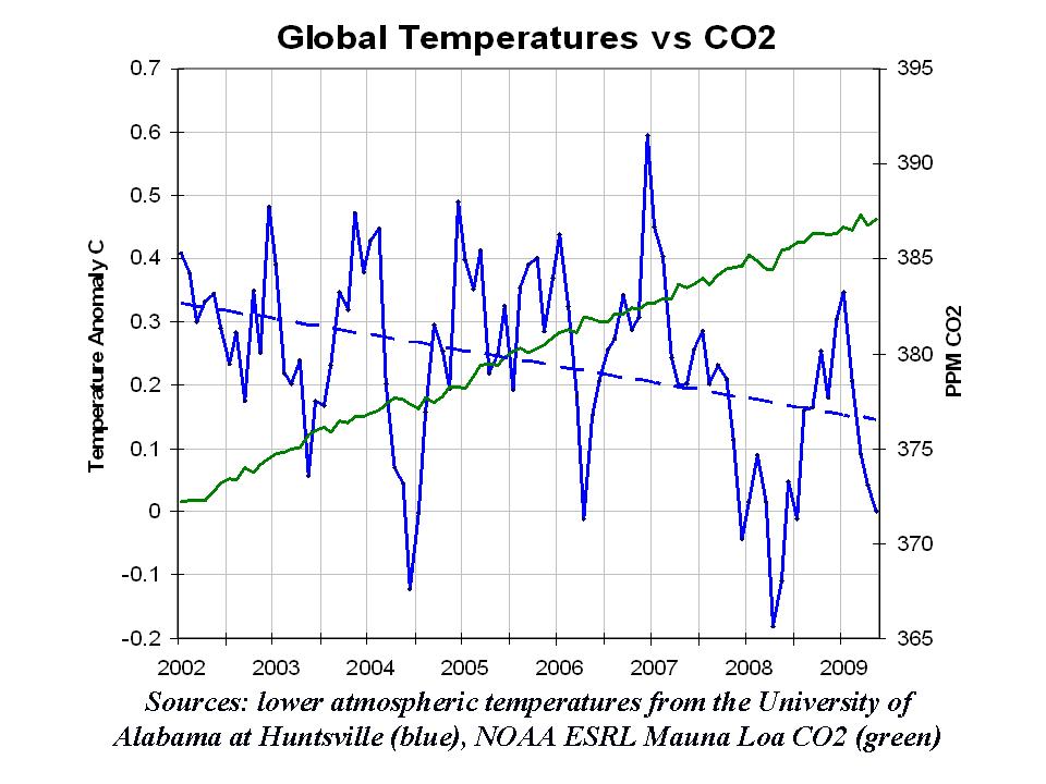
NOAA proclaimed May 2009 to be the 4th warmest for the globe in 130 years of record keeping. Meanwhile NASA UAH MSU satellite assessment showed it was the 15th coldest May in the 31 years of its record. This divergence is not new and has been growing. Just a year ago, NOAA proclaimed June 2008 to be the 8th warmest for the globe in 129 years of record keeping. Meanwhile NASA satellites showed it was the 9th coldest June in the 30 years of its record.
So how could satellite data  – which covers the entire globe and is measured many times a day (not just once or twice) record May 2009 as the 16th warmest year in 31 years, while NOAA reports the same month as the 4th warmest in 130 years? Clearly, one set of data is clearly flawed and in error. And the fact this divergence is consistent means the error is systemic  – it repeats no matter what satellite data is used (satellite instruments are swapped out constantly as the birds end their missions and new ones take over).
The answer is basically called smearing bad data over good data. Modern satellite sensors are incredibly accurate. We can measure the height of the ocean waves to the centimeter level from space. No buoys on the surface can do this, and not across the entire globe. Maybe you can get a rough data point within a couple thousand square miles, but only satellites can measure ocean wave heights across the globe from a single sensor (which makes all the measurements consistent to one sensor’s performance, not the random performance of innumerable and un-calibrated sensors spread all over the globe).
Satellite systems are by far the most accurate and global measurement systems – unless they tell you something you would prefer to pretend did not exist. Then they all of sudden become secondary to antiquated, aging and inconsistent ground based sensors. It like saying I would prefer to navigate via sextant and clock than use a GPS receiver with built in maps and routes.
And that desperate grasp to outdated and error prone measurements is the only methodology showing any global warming, and even this requires a significant amount of massaging the accuracy out of the data to create the science fiction that is man-made CO2 driven global warming:
NOAA and the other station base data centers suffer from major station dropout (nearly 3/4ths of the stations) many of them rural, there has been a tenfold increase in missing months in remaining stations, no adjustment for urbanization even as the population grew from 1.5 billion to 6.7 billion since 1900 and documented bad station siting for 90% of the observing sites in the United States and almost certainly elsewhere.
…
Data is available in the large holes in places like Canada and Brazil and Africa, but NOAA appears not interested in accessing it. The last year has been very cold in Canada.
…
Satellite are widely believed to be the most reliable source of reliable trend information after you calibrate the differences as one bird gets phased out and a new one goes online. UAH and RSS have gotten very good at this in a very cooperative way in recent years. Satellites provide full coverage of the globe including the oceans which cover 70% of the earth’s surface.
When you compare the satellite trends of both UAH and RSS [satellite] with NOAA [ground sensors], you see an increasing warm bias in the NOAA data …
The fact is the global warming alarmists claim to simply be filling the holes in their rickety ground based measurements using satellite data they massage to show what they want to show. It is a trivial exercise in false information generation, as I will show you in the following graph.

Let’s assume we have a constant temperature over a large geographical area which is equal to 1° C. Scattered within this area I have 3 ground based temperature stations which can measure the local temperature to +/- 0.3°C (a ridiculous accuracy given the fact a ground sensor only measures a few feet of atmosphere for hundreds, if not thousands of square miles). Now let’s assume we have a satellite which can measure the temperature exactly – a perfect instrument. When we combined these two measurement sets we get a pattern we see in the top green line in the graph, which I jokingly call the raw measurements. It is perfection with a smattering of imperfection throughout.
The spikes of 0.2 – 0.3 increases in temperature you see are just the larger errors of the ground based sensors sitting on top of the perfect satellite measurements. If we just do an average across the series then we get an error of 3.04% right off the back! Of course, this simple exercise assumes a constant bias upward, but given the siting issues and scarcity of ground sensors there is no doubt there is a warm bias in the data. That has been proven. So just by combing perfect (or less perfect) data with bad data we see the immediate result is worse data overall.
What this illustrates is how you can average in errors and get a badly elevated (and wrong) result.
Now what happens if we try and do a rolling average around those pesky bad data points, to smooth the ground station data on top of the perfect satellite data? Well that is shown in the second red line (moved down 0.2 steps just to separate it graphically from the green line). This exercise tries to spread the bad ground station data out a ways from the single point measurement. It averages the 4 highest data points surrounding the measurement point (which means it drops the lowest of the 5 points which include the data point and its 4 neighbors). This is local hole filling – if the perfect data is considered a ‘hole’.
When we do this we increase the error in the overall data product to +3.08%. We have smeared the one bad data point across the adjacent perfect points and given them weight – as if we were filling in holes in the ground based sensor grid. This is what many alarmists do in their measurements AND their models.
Now what if we really wanted to pretend the satellite data was of much lesser quality (remember it is perfection but we just won’t admit it), and we wanted the ground based data to weigh heavier in the final product? Well we would then do something like we see in the last blue line, where we keep the ground based number as is, and average that out with the adjacent rolling average, basically creating a more gradual drop off as we increase our distance from the ground data point.
This interesting exercise in smearing really covers up all that perfect satellite data under a mountains of ground based errors extrapolated slowly out from the source of the erroneous measurement. In this 3rd case we see an error of +8.4% in the final average! Amazing how well I could cover up that pesky perfect data.
All I did in these lines is compound errors from local sensors using some fancy excuses to write over the perfect nearby (satellite) data with the few localized bad (ground) data points. And this is what is happening at NOAA and GISS and the UN IPCC:
Anthony mentions how in testimony in March 2009 before congress, NCDC’s director Tom Karl opined about satellite data and the “adjustments†required:
“It is important to note raw satellite data and rapidly produced weather products derived from satellite sensors are rarely useful for climate change studies. Rather, an ordered series of sophisticated technical processes, developed through decades of scientific achievement, are required to convert raw satellite sensor data into Climate Data Records (CDRs).â€
It is not all that sophisticated really. It is, in fact, a cheesy and blatant act of misinformation. There is no reason for the 30 years of satellite data not to be right in and of itself. It is fair to say when you go back into history before the era of satellite-based temperature measurements there is room to debate. But within the satellite era the measurements cannot be inconsistent.
There is no way the ground experienced 4 warmer Mays in the last 30 years when the satellites measured 15. And when we go back 130 years this premise or theory becomes improbable, at best. Â Here is the real data, un-smeared:
So we now have irrefutable proof of the existence and source of man-made global warming. The source is falsified data that spreads low quality and less precise measurements over more consistent and higher precision satellite data, masking the fact the Earth has not seen any warming in 3 decades and is right now cooling off slightly (as anyone can see from the cold records being broken).
The cause is man-made bad data, the source is the alarmist. Is there a direct correlation between CO2 and warming? Well, if you correlate all the hot air these snake oil salesmen produce as they raise the false alarm bells then I guess there is one.Â
Face it, these people are trying to steal our money by taxing energy so they can get rich. It’s not all that complicated.
What this


AJ, I’m not so sure that they want to get rich. I think this is more a matter of underlining class distinctions.
The leaders of the modern Left are mostly scions of wealth and privilege. Of Daddy’s Name and Mommy’s Money. Such people fear the upper middle class – and will use their power to crush anyone who dares to aspire to upward mobility.
They don’t care about money – it’s keeping their perks and power that concerns them.
[…] hard on the planet, based on these flawed and fraudulent and “fundamentally wrong” and flim-flamming hoo-hah and clearly “unsettled” sciences and lies that some have worked so diligently to […]
Hmmm…is NOAA actually blending surface point data with satellite data that measures an area mean value?
That is thorny problem, and one that will provide several PhDs in mathematics and statistics.
I was once a research meteorologist, but such blending raises hairs on the back of my neck. You’ve got to be very careful doing it, or you will get garbage results. My instinctual reaction is to say blending isn’t worthwhile doing.
On the otherhand, Reynolds blended buoy and ship SST’s with satellite derived SST’s. But the ocean is better behaved that the atmosphere.
Something to ponder further…
Darth Aggie,
Actually it is clear now one set of data is wrong since their results now differ so greatly. Either June 2009 was the 8th warmest, the 15th warmest or even higher. It can’t be all three.
Satellites are one sensor running for years measuring globally. They have a single source of errors which are measured and calibrated (they design this into the sensor since once in space they can’t fix things).
Ground based measurements are from thousands of less precise, uncalibrated and unmonitored sensors spread thinly around the globe. They only measure a few feet around them.
The satellite sensor measures air columns and takes thousands of measurements around the globe each day.
The error sources combine on the ground based sensors, which I doubt are as precise as the sat sensor in the first place.
What NOAA does is either ignore the sat data or smear it with ground data by combining the sat data with ground data to fill in ground data holes. It is a mathematical error.
But it does produce the results they want.
[…] http://strata-sphere.com/blog/index.php/archives/9852 […]
Part of me wants to say not to be so quick to dismiss surface point observations. But given the dismaying amount of improper siting that has alread been exposed and I’ve seen with my own eyes, the surface met network is so biased as to be nearly unusable.
And as you say, it produces the desired results, so it won’t be fixed any time soon…
[…] LINK […]