Mar 21 2012
Proof Man-Made Global Warming Is Really Man-Made
One thing that really gets under the skin of professionals in my line of business is eff’d up data, especially when the eff’ing up looks to be a deliberate act to deceive.
At NASA there are heart wrenching examples of when computations are wrong:


For those not aware, that is the Space Shuttle Challenger and Columbia, respectively, as we saw them in their final seconds.
When I see people deliberately manipulate data to give a false impression it makes my skin crawl. It’s not just some innocent lying or fooling, in some cases it is a clear act of fraud. It’s the case of the dangerous lie that causes pain suffering I cannot abide, not an untruth for a good cause (like keeping secrets). Sadly, some people are deluded that their cause is worthy of a little untruth. A peculiar arrogance to be sure.
We now have proof Global Warming is man made, in that it has been concocted by con artist pretending to be scientists. And that proof comes from the latest temperature data from that scourge of the scientific process and method, the University of East Anglia’s Climactic Research Unit (CRU).
But first, before we get to their faked data, we should look at CRUs raw data – data they have hidden from the public. Data that was exposed as part of Climategate in 2009. Here is a document that contains CRU generated quarterly temperature graphs for most of the world’s countries prior to being ‘processed’ into a false impression of warming. It is a must read for anyone who wants to know the truth about global temperatures.
Here is one sample of the data for Bolivia:
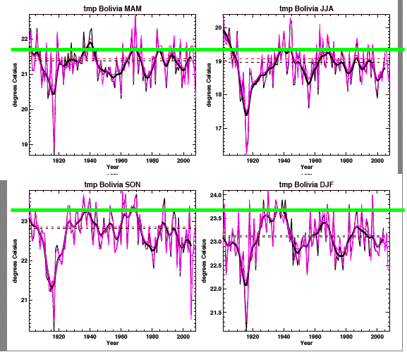
The four graphs represent quarters of a year: March-April-May, June-July-August, September-October-November and December-January-February. The red/purple lines represent the 2008 run of the CRU data, the black lines the 2005 run. The green line was added by me to illustrate how prior temperatures for Bolivia were actually higher than today (especially in the 1930s and 1940s). This example is repeated over much of the world, as I showed in a previous post on this data. Only a fraction of this data shows any significant warming (15-25% based on my earlier assessment).
One of the important results of that prior analysis was to show how the change in peaks for any given country (and any 3 month period) were pretty much insignificant and well within the MEASURED natural variance. For example, look at Argentina MAM.
In the following graphs I first I identify what the lines represent. In the second diagram I show the difference in peak maximum from the pre-1960 period to the 2000’s (in this case ignoring the 1970-1999 period). The final diagram shows the total measure fluctuation for this country during this time of year:
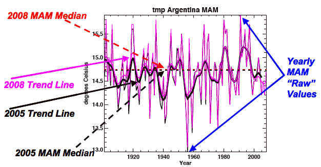
Elements of the CRU Raw Temperature Graphs
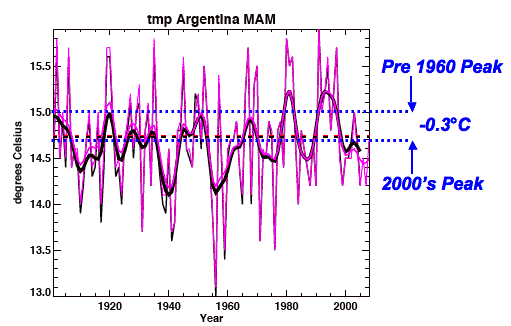
Pre-1960 Peak vs 2000's Peak
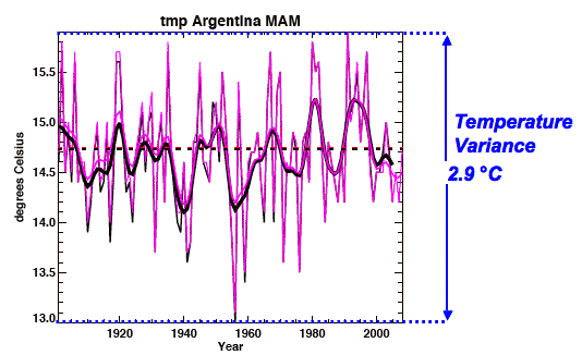
Measured Temperature Variance For MAM, Argentina
The 0.3°C cooling for Argentina MAM in the CRU trend line (already a multi-averaged value) is actually only a 10% change compared to the overall variation in temperature. Hardly significant in my mind. Even if I used the late 20th century peaks it would be a 0.3°C increase. Much ado about nothing. 0.3°C is miniscule compared to daily temperature swings – nature and humanity will survive.
But what really struck me was how few of the graphs come anywhere near showing a rising trend. Most look like this one – random fluctuations across a generally flat trend.
Finally, there is one more important document from CRU and the 2009 whistle blower. This document exposes CRU’s own confidence level of any single year’s regional temperature values, and it is a stunner.
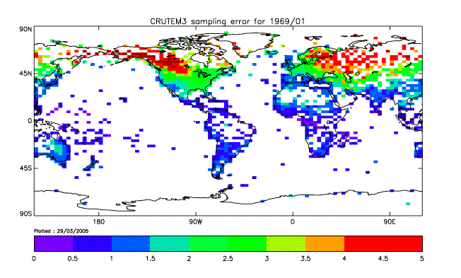
Here we discover CRU’s gridded temperature values for 1969 (and I assume this applies in general to all years, with prior to 1950 being even less ‘accurate’) generally have an error of +/- 1-3°C (light blue to light green). This means it is impossible to discern a sub-degree change in gridded temps over any period. Simple math.
Now let’s look at a key post at WUWT that shows the just released HadCruT4 data, and how it has been ‘adjusted’ since the 2008 release:
Data plotted by Joe D’Aleo. The new HadCRUT4 is in blue, old HadCRUT3 in red, note how the past is cooler, increasing the trend. Of course, this is just “business as usual” for the Phil Jones team. Here’s the older HadCRUT data set from 2001, compared to 2008 and 2010. The past got cooler then too.
To say this differently – the most recent half century period has not warmed at all. What has been ‘adjusted’ is the past – it is now cooler. But of course it is not really cooler. The past is past and is fixed. And our knowledge of the past is limited by the measurement accuracy (both in terms of consistency in instruments, consistency time of measurement, spatial coverage, etc). Globally we have very little accuracy prior to 1950 (we would be lucky if a global number could be within +/- 5°C).
Here is another blast from the past in terms of showing this historic revisionism which is more propaganda than science:

So why does the IPCC and CRU (and GISS, etc) have to keep ‘adjusting’ data to give the impression there has been recent warming?
The reason is because the IPCC has two sets of model outputs baselined and they cannot afford reality to reflect one of those outputs. One output confirms CO2 induced AGW, while the other confirms the IPCC was wrong to ring the alarm bells and all this is for nothing. I addressed this in a post a few years back (as did many others), but it bears repeating. Basically if we have flat temperature records that conform to IPCC sanctioned model outputs like this, the IPCC needs to close up shop:
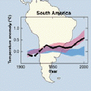
Here we have South America showing two IPCC sanctioned scenarios. The blue output space is flat and represents zero CO2 driven AGW. The reddish band shows what would happen if there is CO2 driven AGW. Guess what the raw data looks like from CRU before adjusting? A reminder from Bolivia (which looks like all of the South American graphs):
Yep – it falls into the blue region. This means South America – as a whole – shows NO CO2 driven AGW. Neigher does North or Central America. And the only way to get the needed late 20th century rise is to drop the early 20th century record down to cooler.
Here is another post on the Nordic area of Europe, showing the same flat line and compared with the IPCC sanctioned model outputs.
So in summary what have we seen is:
- The latest ‘adjusted’ CRU data set shows no recent warming, just historic cooling as they fudged their data once again. These adjustments need to exposed to the public and debated to determine their validity and confidence levels. My guess is they would fail.
- The raw CRU temperature data – prior to ‘adjustment’ – has always shown little to no ‘global‘ warming. It shows some isolated regional warming, and some regional cooling. But over all, the majority of the country records show no significant change in temperature when you compare the early 1900’s to the early 2000’s.
- The raw CRU data lines up extremely well with IPCC model outputs that predict no CO2 induced global warming. Only the ‘adjusted’ data shows the required uptick in temps that comes close to (but not to the same level as) the predicted warming.
- The CRU has reestablished itself as a propaganda house, not an institute of open science.
Nuff said.


AJ:
Thank you for a great post. This is the type of analysis that drew me to your blog several years ago. I try to follow the debate over at WUWT and Climate Audit but sometimes the analyses dip into esoteric areas of climate science that are beyond me. While I can generally follow the math (up to a point) the discussions sometimes become so convoluted/complex that I get lost.
Here you have cut through all the fog and reached the bottom line – the data is being fudged to give the desired answer. And it’s not opinion, it’s thoughtful analysis of their own data. Well done, sir!
Thank you for this AJ. I do believe the lame stream media pushes this rot just to sell newspapers and advertisement for revenue. It’s all about the money. There is nothing wrong with that as long as the general public understands it’s bogus BS.
“Semper Fi”
I have saved so many posts, written by you AJ, on your analysis of climate change. This will be another one…
The sad part, though, is that once a lie is established, fed to the public, accepted by the public, kept on life supports by the liberal MSM, it becomes nearly impossible to disassemble. For instance, you can share your information to a liberal blog discussing global warming, and they will continue to cite ‘science’ as being with the warmers, and that skeptics are nothing but rogue dissenters of the “truth.”
AJ,
Scientific American calling for Global Government to stop climate change.
http://blogs.scientificamerican.com/observations/2012/03/17/effective-world-government-will-still-be-needed-to-stave-off-climate-catastrophe/
but then we already knew what this was all about. Now it’s in the open.
OL