Jan 20 2010
Proof Why Global Warming Alarmists Are Mathematically Wrong
As I have learned more and more about the ‘science’ and ‘math’ that is the foundation of the man-made global warming (AGW) theory, the more I realize how amateurish that science and math really is. For those of us who deal day in and day out in complex physical systems, driven by multiple natural forces that are working on scales that few humans can get their heads around (e.g., the exploration of space), the case for global warming is incredibly flawed.
What I will do in this long and technical leaning post is identofy where the global human induced warming(AGW) math completely falls apart, bringing down the entire house of cards that is the AGW theory. This is different from what other skeptics are doing by trying to reproduce the flawed process of creating a global index for today and then running back to 1880. In my view, the approach used to create a global index from land based sensors is fatally flawed, and we can prove it beyond a shadow of any doubt.
My basic premise is the very large and complex set of natural systems driving Earth’s climate cannot be measured sparsely and then declared to be completely understood on a global scale. The core of the problem with the current theories is in the calculation of uncertainty or error – which directly reflects on the confidence of the results. The process of globalizing these sparse measurements causes this error to rapidly explode when extrapolated to small regions, let alone global scales.
The basic question is whether the noise in the raw data is so high that it is impossible to detect a global rise of less than 1° C over a century (the current claim of the AGW crowd). I will show that even today’s computations of a global temp index are incapable of an accuracy to 1°C, let alone to that same confidence back to 1880.
Where the AGW ‘scientists’ make their fatal mistake is not understanding how temperature accuracy decays over distance. Once you measure this decay rate (which is easy to do) it becomes clear we cannot develop a global temperature index of even modest precision from land based sensors
Here is the first of two diagrams that lit the light bulb for me. it is the global temperature map using methodologies employed by the IPCC and AGW theorists for years and is based on land based measurements extrapolated up to global scales.

The thing you have to understand about this map is it is 99+% guesstimates! Only a tiny fraction  of the map is actually measurement. And those guesstimates are very imprecise.
The CRU, GISS and NCDC all derive global profiles by making some incredible and unproven assumptions about how a temperature measurement can be extrapolated to represent a city, a region, a country, a hemisphere and the globe. For example, in the CRU data they assume you can create a 500 km ‘grid’ from one or a small number of temperature stations. Even worse, they assume you can create a neighboring 500 km grid that has no stations from nearby grids (which are poor guesstimates in the first place, adding insult to injury).
It is pure folly, as a simple analysis can show on any given day of the year.
For my back of the envelope analysis I used local temperature data from the area I live in north and east of Washington DC. I looked at one day (Nov 3, 2002) to measure how temperature varies over small distances. The data is from 40 stations contained in an area that is about 100 miles (160 km) in radius running from Wilmington, DE to Dulles International Airport in Dulles, VA.
This area is geographically and climatically consistent in altitude, vegetation, urbanization, distance from large bodies of water, etc. This consistency means the temperature variability we see on any given day is the best we could ever expect in terms of predicting temperatures across similar sized regions. Regions with more diversity will have even worse variability.
Therefore this example will provide an uncertainty/error floor for the decay of temperatures over distances of 100 miles (160 km). You cannot do better than this in extrapolating a measurement over distance.. It is the NATURAL variability in temperature over distance and cannot be made more precise by any amount of statistical methodologies. It is not a guess or extrapolation, it is measurement of what was.
Here is the graph of daily high temperature (dark blue line) along with a 1 standard deviation error bar (light blue bars).
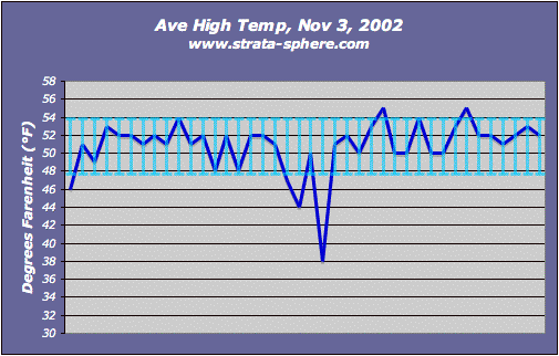
I just picked one day at random, but I doubt this specific day is uniquely special to be an incredible outlier. Of course, anyone can do this same method any day for any region in the US and Europe. From my near 50 years of living here I would say this is a typical day and not even close to the variability we have seen on occasions when weather fronts run through the region.
I used a variety of statistical tests on this data set to prove my point and here are the results.
- The minimum value was 38°F with the highest being 55°F.
- The measured range was 17°F for this typical day in November.
- The average (mathematical mean) was 50.8°F, with a standard deviation [1] of 3.05°F.
- The average deviation was 2.00°F.
Therefore I claim that when you extrapolate a single station (or even 40 stations) out 160 km the best you could ever hope for is an uncertainty of +/- 2°F.  The accuracy of this temperature product decays even further when you extrapolate out to a 500 km grid. It is trivial for anyone to repeat this analysis for larger regions with more variability in altitude, vegetation, etc. But this example will probably always be the best possible given its homogeneous nature.
If we see +/- 2°F on any given day, in a geographically consistent area over 160 km, what do you think we will see over 1000 km? Over the hemisphere or globe?
Well, we can see how bad the guesstimates are in the first diagram by comparing those gridded estimates with actual measurements! Yes folks, not only can we measure the decay of temperature over distance, we can confirm that the NCDC, GIS and CRU products are way off in terms of extrapolating temperatures over large distances.
This brings me to the second graph of global temperature which initiated this post, It is a graph of actual temperature measurement from satellites.

In this data there is very small extrapolation (cells) and all of this is measurement with known accuracy/error (since the satellite is making measurements at least once a day over each segment of the land). Therefore, unlike the other chart, this is not mostly unproven guesstimates. Which in turn means this data can be used to verify how bad the estimated temperatures are created by the CRU, GISS and NCDC method.
For every grid cell that is extrapolated in the old method, for periods that overlap these satellite measurements, we can show how those guesstimates drift from the measured temp. Since it is the same satellite instruments are measuring each cell with lots of ground stations, only a few stations or no stations at all, there should be a constant difference in the guesstimates if they are indeed accurate.
A simple eyeball comparison indicates they are not constant. The old method shows a lot more red and less blue than the satellite measurements, therefore the old method has a lot of drift from reality. There is a record of measured values from sats, we just need to do the comparison to the raw and gridded data to illustrate the level error in GIS, NCDC and CRU guesstimates.
This is why I think it is waste of time to keep using the flawed approach of extrapolating a ground measurement to a regional or global index. At least until you work out a way to make that extrapolation consistent with actual sat data.
Since both data sets exists it will take someone with more time than I have but little effort to prove how badly off the AGW estimates are. Given the AGW track record on reproducing historic temperature trends or predicting future patterns I am confident the results won’t be good for the IPCC crowd.
I want to also demonstrate why the ground station method is really 99+% guess.
The Earth’s land mass covers 148,490,000 square kilometers. If a single ground station is accurate to 0.1° C over a distance of 10 km (6 miles) then you would need 14,849,000 stations to accurately measure the Earth’s surface (not accounting for sensor errors, etc). If you only have 14,849 stations (which is close to the actual number employed) you have only measured 0.1% of the surface. But these would have to be uniformly distributed over the surface, which they are not of course, so the coverage of the Earth is less than this.
Which means the top graph could be 99.9+% percent inaccurate because it is based on such a small set of actual measurements and the rest is based on extrapolating the data well beyond its inherent natural accuracy. Any number popping out of the top graph could be off by +/- 2°F or  more given temp decay over distance just from natural variability. Which means the claimed warming detected by these groups is false. It is a ghost in the noise.
I also performed another analysis to show how temperature measurements in the same place, each day, have a significant, inherent natural fluctuation which dwarfs the 0.8°C claim of ‘out of control’ warming in the last century.
We find that normal temperature ranges are quite large over much of the globe over the seasons. Except for the regions around the equator where temps are incredibly steady, these kind of daily and seasonal fluctuations would be ‘normal’ and expected all year long. How do you detect a 0.8°C signal in a natural fluctuation of 2-5 degrees?
This is a natural range and is not speculation. I can go right to the CRU data released with Climategate emails and files to prove this, specifically this file of seasonal mean temperatures from all over the globe. I used this data in this post where I analyzed the graphs to determine if the measured temperature change (quarterly average by country, not daily measurements from stations) were real signals or just phantoms in the noise.
One of the analyses I did was to note the temperature range in each of the graphs. I captured my results in this spreadsheet, using the 2005 data (HADCRUT2), which is the black lines in the graphs. The 2008 data (HADCRUT3) is in the magenta and red.
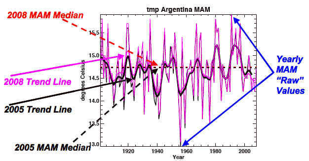
As this sample graph shows the temperature can range greatly even on this seasonal scale (in this case ranging 2.9°C). I measured the temperature range for each country, for each season from the graphs. Then I averaged the temperature ranges for each season over the year for each country, and then over the major regions of the Earth (e.g., South American, Central America, Europe, Pacific, etc).
If you go to the results you can find the annual averages in the purple columns, and the seasonal data in the four columns to the left of this column.
The smallest annual range for any region is in the Pacific, coming in at 1.88°C, since it is dominated by measurements from near the equator. In contrast North America had an annual range of 4.03° and Europe had a range of 6.17°C, both of which include measurements from higher latitudes and altitudes. This is quite a range for normal temps, but not unexpected.
As I noted in this post, the one place on Earth were a significant warming trend should easily show up (because it has such a tight temp range) showed nothing significant. And this is CRU’s own data!
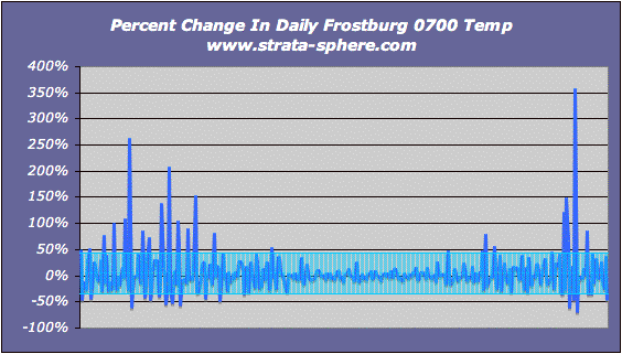
Just for fun I decided to take measurements from one site over a year and compute the natural variability day to day. The site is Frostburg, MD, the year is 2002. It was selected because it had data I could grab easily! But people can pick any weather station data and perform the same checks for any place on Earth.
The first graph is of the daily temperatures taken each day at the same time (0700) starting January and ending in December.
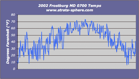
Just a glance shows how daily temperatures can change quite dramatically in just a day or two. But what is the natural variability? To get a hint I computed the change day-to-day and computed the 1 std dev of that change to measure what was the normal range of temp variability for this year in history:
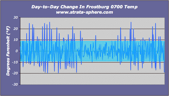
What we find is a normal/natural day-2-day variation of temperature – taken at the exact same time of day – of +/- 8.85°F! That is a lot of natural variability. Can anyone prove a 0.8°C change in that range can be detected over 100 years and be deemed significant?
Temperatures are interesting, but I like to know how much of a percent change are we seeing day-2-day. For example, a 1° change when the temp is 10° is much more dramatic than when the temp is 100°. So I graphed the percent change day-to-day, and the std dev [1] to see what is the typical percent change in temps – I was really surprised at this result.
The standard deviation in percent temperature change was 38.5%! It seems Mother Nature is a fickle being. It is also clear (as would be expected) the percent change is high during the winter (left-right ends) and low during the summer (center).
To remove some of the day-to-day dynamics I decided to run the last two graphs using a 4 day running average. Here is the temp change over a 4 day average:
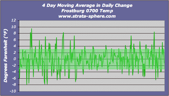
It produces a standard deviation (normal variability) of +/- 3°F. When I used a 7 day moving average the standard deviation fell to 2°F.  Here is the percent change using the 4 day moving average:
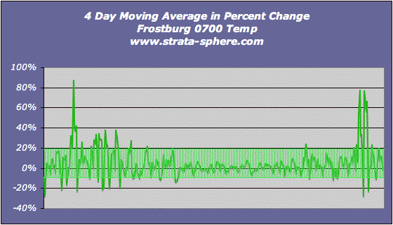
It shows a 14% standard deviation in the 4 day moving average, which really is the natural variability for this year and this location.
The take away from these last charts is we can measure the natural variability in temperature for a myriad of regions (low altitude, high altitude, equatorial island, high latitude, etc). We can then assess whether there is any significant change in temperature for that region.
What I saw in the CRU data is that nearly 85% of the peak warming between the 1880-1960 period and the 2000’s was insignificant different (which I defined as being less than 20% of the normal temperature variance). And the 15% of the world were there might be significant change, some regions cooled and others warmed.
What is clear from these two simple analyses is that any regional (≥ 160 km) or global temperature index is too inaccurate to detect a 0.8°C rise over 100 years. We can’t even get to that level of accuracy when we are really guesstimating 99.9% of the actual temperature from sparse ground sensors.
And even if there was a 0.8°C rise, is that really significant given the daily ranges temperatures can swing?
All this proves the AGW theories are mathematically invalid, there claimed results are impossible to achieve with the approach they use.


True, but what if I were measuring the change in salinity? I would have a 100 sensors picking up only salt water and later I would have the same 100 sensors picking up only salt water. Since my hypothetical sensors are in the same locations, and I can certainly measure whether or not saltiness has changed.
However we know from the temperature records that the sensors have moved. Both individual sensors have moved and a large percentage disappeared with the end of the cold war and for other reasons. My hypothetical sensors are better than the reality of the temperature sensors.
As for measuring only a tiny percentage of the globe, I don’t think you have shown why a long term delta can’t be measured in one part of the globe. You only showed that short term deltas are large, but that doesn’t prove that small long term deltas can’t be measured.
eric,
You still have the same problem – you cannot extrapolate your measurements to represent the globe. Too few samples.
BTW, I am not the one who has to prove the sparse measurements over time are indicative of anything global. All I noted was the error bars on their measurements expand massively as they attempt to derive a global index, which makes their results garbage.
Eric,
BTW, anyone can determine the accuracy of these interpolations by comparing local temp measurements (the root data), averaged grid temps where data exists (the first introduction of error) and the estimates for grids without data (the 2nd introduction of error and the most unproven step in computing a global index) by comparing these to satellite measurements.
You will get a delta from the ground measurement and the sat measurement, you will get a delta from the averaged grid measurement with the SAME sat measurement, and you will get a delta from the grid with 100% guesstimated temp to the SAME sat measurement. These will not be equal and will grow in size as you move from the ground measurement outward.
If you do this over many days or years, you can determine with high precision the error in the extrapolation method to real temps.
If/when someone does this you will see how off the GISS, NCDC and CRU index is, and it will be on the order of degrees, not tenths of a degree as they claim.
And that will be the end of those theories.
[…] it beyond a shadow of any doubt. Proof Why Global Warming Alarmists Are Mathematically Wrong The Strata-Sphere Proof Why Global Warming Alarmists Are Mathematically Wrong __________________ Mirko: Well, you can read funny things online. I guess we'll just have to […]
Great work! I can tell from your post that you are an engineer and not a scientist. The difference is that and engineer will compare his model to the data and tweak the model to match the data. A scientist on the other hand, will tweak the data to match the model. Such arrogance.
[…] goes to exactly what I wrote about here and the decay of a temperature over short distances. 99.99+% of the global temperatures are made up […]
[…] video also proves once again my assessment that a temperature measurement decays rapidly with uncertainty (or error) within 100 km. That […]
Has no one else really not spotted the fact that the original poster has no idea as regards error on the mean……………………
* The average deviation was 2.00°F.
Therefore I claim that when you extrapolate a single station (or even 40 stations) out 160 km the best you could ever hope for is an uncertainty of +/- 2°F.
Which is nonsense – just because natural variability at one point of two dgerees does not mean that this is also the error on the mean temperature at that point. And if you don’t understand that, then you don’t understand even the most basic parts of statistical analysis — hence anything you have to say about the validity or otherwise of spatial sampling can be dismissed as meaningless.
Sad to see that so many posters seem to accept the whole of this article without comment, which suggests that they don’t understand even the most basic stats either……………………
Speaker,
Actually, no it is not wrong. The area I sampled is quite benign and very homogenous. It means that when you extrapolate 100’s of km’s your error bars grow (call it uncertainty if it helps, but it is the error in your extrapolated temp).
It means any claim to know a extrapolated temperature is +/- 2° because of the system being measured! The error comes from ignorance as to what the temperature really is 100 km’s away. And note I used STD DEV 1. I gather your brilliant mind can understand what happens to extrapolated temps if I want 95% confidence the number extrapolated is accurate??
What is sad to see is rank amateurs missing the point of basic mathematics. The GIS data map of the world, being 99.99+% extrapolated measurements is only valid to +/- 5° or so. Which means it cannot detect a change of 0.5°.
Duh. Maybe you should stick to speaking to animals.
And maybe you should learn some basic stats. The argument you attempted to present was supposed to be about the mean temperature at a fixed location for starters. This supposed example pops up several times.
Except you keep taking the uncertainty on this at the variation over time, whereas the error on the mean is less than this — a little something called error on the mean.
Yes, very easy to say — wow, with a natural variation of umpteen degrees, how can anyone claim to measure differences which are a fraction of that natural variability. Except the whole basic statistical point about the distribution of single measurements versus the distribution of the mean of a sequence of measurements is what allows you to do that.
Even if you do know this, your supposed initial example, which repeatedly presents plus or minus two degrees as the relevant uncertainty is profoundly misleading, since it creates the impression that natural variability is as accurate as you can get on anything, which is not the case.
To give a simple example that most people DO understand. I measure the heights of adult males across the UK. There is a large natural variability, yet if I take enough samples, I get a decent estimate of the mean height.
Let’s take adult males in another country. If all I took was one chap from each country, I can’t say much. Yet if I take a sample from each, I can meaningfully detect differences in the MEAN height of individuals that is far less than the natural variability in individual heights.
Hence what matters is NOT just natural variability, but natural variability divided by square root of the number of measurements — that is the appropriate error, and the figure that should be considered.
Hence we have the totally incorrect statement:
And even if there was a 0.8°C rise, is that really significant given the daily ranges temperatures can swing?
Yes, because I assume that decent scientists can do basic stats, and correctly compute errors on the mean.
LOL! I am well beyond the basics. You can try to claim I did not mean what I said, but those kind of lame strawman arguments won’t fly here.
I was clear in what I was showing (back of the envelope – in case you missed it in the post). The natural variability is perfectly legitimate when claiming you can extrapolate temperatures thousands of kilometers without taking into account the uncertainty (and thus error in conclusions drawn from said extrapolation.
I must admit, you are pretty poor at this. I did not take one temperature. I took many temperatures and produced their population variability. The data is on a series of regional high temps, not one.
Go back and read it again and see if you can keep up. That was the population of temp ranges over 100 km. That is the most benign we will see in most places over those distances. Go back and do the compounding of uncertainty, and prove to us how you can produce a result of .8° as significant with an uncertainty of +/- 5° C? Is that your ‘professional’ claim?
ROFTLMAO!
Speaker,
After reading your comment again I am still laughing. Especially this part:
Yes, very easy to say — wow, with a natural variation of umpteen degrees, how can anyone claim to measure differences which are a fraction of that natural variability. Except the whole basic statistical point about the distribution of single measurements versus the distribution of the mean of a sequence of measurements is what allows you to do that.
What is so funny is you confuse ‘measurement’ with ‘predicting’. 99.99+% of the temperatures used to ‘measure’ climate change are not measurements at all. They are predicted measurements based on unfounded extrapolation.
As I PROVED the certainty in any temperature MEASUREMENT decays rapidly over distance. Therefore you are not MEASURING the globe or region, you are predicting what nearby temperatures MAY be (with a lousy certainty, or massive error – take your pick).
You actually think running statistics on shoddy predictions is ‘measuring’ something? Too funny.
In the space business we don’t rely on trends in questionable estimates, predictions or guesstimates. We measure the decay of any measurement in any dimension to understand how much we can rely on it. If it decays too fast (uncertainty rises) we don’t use it because it leads to all sorts of wrong conclusions.
Maybe folks who use simple stats should learn more about things like Kalman filters and their proper application to complex physical systems – like climate and the atmosphere.
Lets take another choice quote:
What we find is a normal/natural day-2-day variation of temperature – taken at the exact same time of day – of +/- 8.85°F! That is a lot of natural variability. Can anyone prove a 0.8°C change in that range can be detected over 100 years and be deemed significant?
Uh, YES, because of the error on the mean, in effect. You can measure changes in the mean value of noisy data — except you have to fully understand statistics to understand whether or not what you have computed is statistically significant.
Why do you keep using these same ole incorrect arguments? Perhaps I can guess — because they sound totally obvious and totally plausible to those who have no knowledge of stats whatsoever. Also, gives such readers a nice warm feeling that they can spot something so totally obvious that those nasty academics only try to hide from us by wittering on about statistics and using alll those long words.
I won’t speculate further as to whether your understanding of statistics is really as bad as it seems to be, but add that if it isn’t, using such examples is grossly dishonest.
Speaker,
Give it up. You have proven to be less a genius and more challenged in reading comprehension. So you measured the variance in the noise!
BFD. You confuse a statistical number with a real world phenomena – they are not connected until you demonstrate the signal is outside the noise.
What you have failed to do is account for all the steps in the noise. The measurement itself has minor errors. The averaging over distance and time imparts enormous uncertainties on top of these which raise the noise level.
I mean do the math yourself! Take the daily measurements – then compute the uncertainty in coming up with a daily high and low for that 1 km circle. Then compute averages for a grid 500X500 km with proper decays in uncertainty. Then compute the additional uncertainties when you extrapolate from one grid with measurements to one without (half the grids on the planet are probably done this way).
Then come back and tell me the answer – if you dare!
Speaker,
Since you are so fond if simple examples let me give you one. So your measuring inch worms with a yard stick and you get zero or 1 yard in your samples and you decided the mean was half a yard with high statistical confidence I would buy it. But if you said from all those measurements you could tell the inch worm grew 0.4 inches over the last year I would rightfully laugh in your face.