Jan 20 2010
Proof Why Global Warming Alarmists Are Mathematically Wrong
As I have learned more and more about the ‘science’ and ‘math’ that is the foundation of the man-made global warming (AGW) theory, the more I realize how amateurish that science and math really is. For those of us who deal day in and day out in complex physical systems, driven by multiple natural forces that are working on scales that few humans can get their heads around (e.g., the exploration of space), the case for global warming is incredibly flawed.
What I will do in this long and technical leaning post is identofy where the global human induced warming(AGW) math completely falls apart, bringing down the entire house of cards that is the AGW theory. This is different from what other skeptics are doing by trying to reproduce the flawed process of creating a global index for today and then running back to 1880. In my view, the approach used to create a global index from land based sensors is fatally flawed, and we can prove it beyond a shadow of any doubt.
My basic premise is the very large and complex set of natural systems driving Earth’s climate cannot be measured sparsely and then declared to be completely understood on a global scale. The core of the problem with the current theories is in the calculation of uncertainty or error – which directly reflects on the confidence of the results. The process of globalizing these sparse measurements causes this error to rapidly explode when extrapolated to small regions, let alone global scales.
The basic question is whether the noise in the raw data is so high that it is impossible to detect a global rise of less than 1° C over a century (the current claim of the AGW crowd). I will show that even today’s computations of a global temp index are incapable of an accuracy to 1°C, let alone to that same confidence back to 1880.
Where the AGW ‘scientists’ make their fatal mistake is not understanding how temperature accuracy decays over distance. Once you measure this decay rate (which is easy to do) it becomes clear we cannot develop a global temperature index of even modest precision from land based sensors
Here is the first of two diagrams that lit the light bulb for me. it is the global temperature map using methodologies employed by the IPCC and AGW theorists for years and is based on land based measurements extrapolated up to global scales.

The thing you have to understand about this map is it is 99+% guesstimates! Only a tiny fraction  of the map is actually measurement. And those guesstimates are very imprecise.
The CRU, GISS and NCDC all derive global profiles by making some incredible and unproven assumptions about how a temperature measurement can be extrapolated to represent a city, a region, a country, a hemisphere and the globe. For example, in the CRU data they assume you can create a 500 km ‘grid’ from one or a small number of temperature stations. Even worse, they assume you can create a neighboring 500 km grid that has no stations from nearby grids (which are poor guesstimates in the first place, adding insult to injury).
It is pure folly, as a simple analysis can show on any given day of the year.
For my back of the envelope analysis I used local temperature data from the area I live in north and east of Washington DC. I looked at one day (Nov 3, 2002) to measure how temperature varies over small distances. The data is from 40 stations contained in an area that is about 100 miles (160 km) in radius running from Wilmington, DE to Dulles International Airport in Dulles, VA.
This area is geographically and climatically consistent in altitude, vegetation, urbanization, distance from large bodies of water, etc. This consistency means the temperature variability we see on any given day is the best we could ever expect in terms of predicting temperatures across similar sized regions. Regions with more diversity will have even worse variability.
Therefore this example will provide an uncertainty/error floor for the decay of temperatures over distances of 100 miles (160 km). You cannot do better than this in extrapolating a measurement over distance.. It is the NATURAL variability in temperature over distance and cannot be made more precise by any amount of statistical methodologies. It is not a guess or extrapolation, it is measurement of what was.
Here is the graph of daily high temperature (dark blue line) along with a 1 standard deviation error bar (light blue bars).
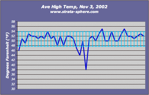
I just picked one day at random, but I doubt this specific day is uniquely special to be an incredible outlier. Of course, anyone can do this same method any day for any region in the US and Europe. From my near 50 years of living here I would say this is a typical day and not even close to the variability we have seen on occasions when weather fronts run through the region.
I used a variety of statistical tests on this data set to prove my point and here are the results.
- The minimum value was 38°F with the highest being 55°F.
- The measured range was 17°F for this typical day in November.
- The average (mathematical mean) was 50.8°F, with a standard deviation [1] of 3.05°F.
- The average deviation was 2.00°F.
Therefore I claim that when you extrapolate a single station (or even 40 stations) out 160 km the best you could ever hope for is an uncertainty of +/- 2°F.  The accuracy of this temperature product decays even further when you extrapolate out to a 500 km grid. It is trivial for anyone to repeat this analysis for larger regions with more variability in altitude, vegetation, etc. But this example will probably always be the best possible given its homogeneous nature.
If we see +/- 2°F on any given day, in a geographically consistent area over 160 km, what do you think we will see over 1000 km? Over the hemisphere or globe?
Well, we can see how bad the guesstimates are in the first diagram by comparing those gridded estimates with actual measurements! Yes folks, not only can we measure the decay of temperature over distance, we can confirm that the NCDC, GIS and CRU products are way off in terms of extrapolating temperatures over large distances.
This brings me to the second graph of global temperature which initiated this post, It is a graph of actual temperature measurement from satellites.

In this data there is very small extrapolation (cells) and all of this is measurement with known accuracy/error (since the satellite is making measurements at least once a day over each segment of the land). Therefore, unlike the other chart, this is not mostly unproven guesstimates. Which in turn means this data can be used to verify how bad the estimated temperatures are created by the CRU, GISS and NCDC method.
For every grid cell that is extrapolated in the old method, for periods that overlap these satellite measurements, we can show how those guesstimates drift from the measured temp. Since it is the same satellite instruments are measuring each cell with lots of ground stations, only a few stations or no stations at all, there should be a constant difference in the guesstimates if they are indeed accurate.
A simple eyeball comparison indicates they are not constant. The old method shows a lot more red and less blue than the satellite measurements, therefore the old method has a lot of drift from reality. There is a record of measured values from sats, we just need to do the comparison to the raw and gridded data to illustrate the level error in GIS, NCDC and CRU guesstimates.
This is why I think it is waste of time to keep using the flawed approach of extrapolating a ground measurement to a regional or global index. At least until you work out a way to make that extrapolation consistent with actual sat data.
Since both data sets exists it will take someone with more time than I have but little effort to prove how badly off the AGW estimates are. Given the AGW track record on reproducing historic temperature trends or predicting future patterns I am confident the results won’t be good for the IPCC crowd.
I want to also demonstrate why the ground station method is really 99+% guess.
The Earth’s land mass covers 148,490,000 square kilometers. If a single ground station is accurate to 0.1° C over a distance of 10 km (6 miles) then you would need 14,849,000 stations to accurately measure the Earth’s surface (not accounting for sensor errors, etc). If you only have 14,849 stations (which is close to the actual number employed) you have only measured 0.1% of the surface. But these would have to be uniformly distributed over the surface, which they are not of course, so the coverage of the Earth is less than this.
Which means the top graph could be 99.9+% percent inaccurate because it is based on such a small set of actual measurements and the rest is based on extrapolating the data well beyond its inherent natural accuracy. Any number popping out of the top graph could be off by +/- 2°F or  more given temp decay over distance just from natural variability. Which means the claimed warming detected by these groups is false. It is a ghost in the noise.
I also performed another analysis to show how temperature measurements in the same place, each day, have a significant, inherent natural fluctuation which dwarfs the 0.8°C claim of ‘out of control’ warming in the last century.
We find that normal temperature ranges are quite large over much of the globe over the seasons. Except for the regions around the equator where temps are incredibly steady, these kind of daily and seasonal fluctuations would be ‘normal’ and expected all year long. How do you detect a 0.8°C signal in a natural fluctuation of 2-5 degrees?
This is a natural range and is not speculation. I can go right to the CRU data released with Climategate emails and files to prove this, specifically this file of seasonal mean temperatures from all over the globe. I used this data in this post where I analyzed the graphs to determine if the measured temperature change (quarterly average by country, not daily measurements from stations) were real signals or just phantoms in the noise.
One of the analyses I did was to note the temperature range in each of the graphs. I captured my results in this spreadsheet, using the 2005 data (HADCRUT2), which is the black lines in the graphs. The 2008 data (HADCRUT3) is in the magenta and red.
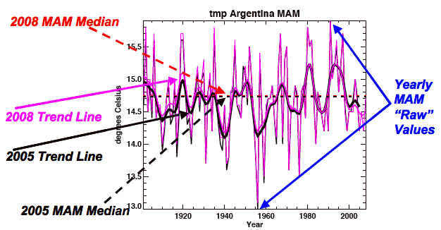
As this sample graph shows the temperature can range greatly even on this seasonal scale (in this case ranging 2.9°C). I measured the temperature range for each country, for each season from the graphs. Then I averaged the temperature ranges for each season over the year for each country, and then over the major regions of the Earth (e.g., South American, Central America, Europe, Pacific, etc).
If you go to the results you can find the annual averages in the purple columns, and the seasonal data in the four columns to the left of this column.
The smallest annual range for any region is in the Pacific, coming in at 1.88°C, since it is dominated by measurements from near the equator. In contrast North America had an annual range of 4.03° and Europe had a range of 6.17°C, both of which include measurements from higher latitudes and altitudes. This is quite a range for normal temps, but not unexpected.
As I noted in this post, the one place on Earth were a significant warming trend should easily show up (because it has such a tight temp range) showed nothing significant. And this is CRU’s own data!
Just for fun I decided to take measurements from one site over a year and compute the natural variability day to day. The site is Frostburg, MD, the year is 2002. It was selected because it had data I could grab easily! But people can pick any weather station data and perform the same checks for any place on Earth.
The first graph is of the daily temperatures taken each day at the same time (0700) starting January and ending in December.
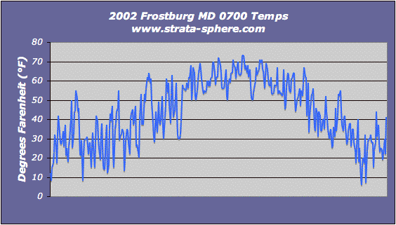
Just a glance shows how daily temperatures can change quite dramatically in just a day or two. But what is the natural variability? To get a hint I computed the change day-to-day and computed the 1 std dev of that change to measure what was the normal range of temp variability for this year in history:
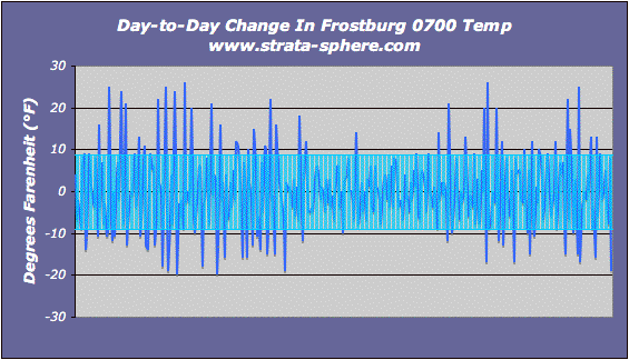
What we find is a normal/natural day-2-day variation of temperature – taken at the exact same time of day – of +/- 8.85°F! That is a lot of natural variability. Can anyone prove a 0.8°C change in that range can be detected over 100 years and be deemed significant?
Temperatures are interesting, but I like to know how much of a percent change are we seeing day-2-day. For example, a 1° change when the temp is 10° is much more dramatic than when the temp is 100°. So I graphed the percent change day-to-day, and the std dev [1] to see what is the typical percent change in temps – I was really surprised at this result.
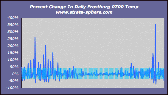
The standard deviation in percent temperature change was 38.5%! It seems Mother Nature is a fickle being. It is also clear (as would be expected) the percent change is high during the winter (left-right ends) and low during the summer (center).
To remove some of the day-to-day dynamics I decided to run the last two graphs using a 4 day running average. Here is the temp change over a 4 day average:
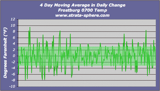
It produces a standard deviation (normal variability) of +/- 3°F. When I used a 7 day moving average the standard deviation fell to 2°F.  Here is the percent change using the 4 day moving average:
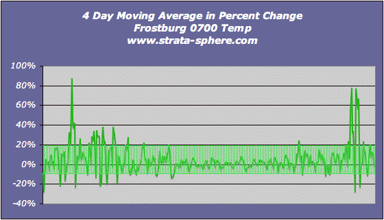
It shows a 14% standard deviation in the 4 day moving average, which really is the natural variability for this year and this location.
The take away from these last charts is we can measure the natural variability in temperature for a myriad of regions (low altitude, high altitude, equatorial island, high latitude, etc). We can then assess whether there is any significant change in temperature for that region.
What I saw in the CRU data is that nearly 85% of the peak warming between the 1880-1960 period and the 2000’s was insignificant different (which I defined as being less than 20% of the normal temperature variance). And the 15% of the world were there might be significant change, some regions cooled and others warmed.
What is clear from these two simple analyses is that any regional (≥ 160 km) or global temperature index is too inaccurate to detect a 0.8°C rise over 100 years. We can’t even get to that level of accuracy when we are really guesstimating 99.9% of the actual temperature from sparse ground sensors.
And even if there was a 0.8°C rise, is that really significant given the daily ranges temperatures can swing?
All this proves the AGW theories are mathematically invalid, there claimed results are impossible to achieve with the approach they use.


So, the data is crap, the methodology is crap and the computer programs are crap. This would seem to imply the whole darn mess is crap. Can we combine a lot of pieces of crap and get a sound theory from it? Well, that was the idea behind the mortgage-backed securities that almost blew the financial system away in 2008; that you could take a bunch of lousy credits and package them together to make a AAA-rated bond. Also sounds an incredibly nonsensical, until you realize that the driving force behind that lunacy was also a wonderful mathematical model produced by “geniuses”. I think I detect a pattern here….
[…] And lastly an interesting read: The Strata-Sphere Proof Why Global Warming Alarmists Are Mathematically Wrong […]
“about the ’science’ and ‘math’ that is the foundation of the man-made global warming (AGW) theory, the more I realize how amateurish that science and math really is. For those of us who deal day in and day out in complex physical systems, driven by multiple natural forces that are working on scales that few humans can get their heads around (e.g., the exploration of space), the case for global warming is incredibly flawed.”
I see you put the words science and math in apostrophe’s, for good reason….there is no science or math associated with the AGW movement. There is nothing but lies and deceit. You can not use their ‘data’ to prove that they are either right, or wrong. very simply put, for the same reason you can’t add 2+2 and use the result to prove why a rocket won’t make it to the moon. It has no relationship.
I admire all the work you’ve put into this to show that it’s all BS, but one does not have to be a rocket scientist or a genius to recognize the total crap involved in all this. In fact, I’m not sure what to label someone that does proclaim that they believe in AGW.
It gets pretty bad. All of California, for example, is represented by four weather stations … all of them are on the coast. California’s weather varies WIDELY over distances of only 50 miles. Check out the difference in temperature between San Juan Capistrano and Hemit or Hemit and Idyllwild or Idyllwild and Palm Springs. The differences are amazing.
The entire continent of Antarctica is represented by one single weather station in the warmest part of the continent.
It’s just crazy.
There used to be thousands of stations in the US that were used for generating the observed temperature. There are now only a couple of hundred.
OT – THIS IS JUST PLAIN NUTS!
http://www.usatoday.com/NEWS/usaedition/2010-01-20-haitifood20_ST_U.htm?csp=34
This Obama government is just plain crazy!
Obama is so worried about the political fallout from people complaining that it looks like the US military is occupying Haiti that he is willing to cut off food aid and let people go hungry so he doesn’t look bad in the eyes of people like Castro and Chavez.
I am sorry, I have no better word .. what an ass.
[…] This post was mentioned on Twitter by Gratis Guidance, AJ Strata. AJ Strata said: new: Proof Why Global Warming Alarmists Are Mathematically Wrong http://strata-sphere.com/blog/index.php/archives/12246 […]
crosspatch, regarding the Haiti situation – there’s an ironclad rule of bureaucratic organizations, doesn’t matter whether it’s governments or corporations: Unless someone at the very top puts their foot down and demands a focus on the mission, the lower levels always devolve into squabbling and intramural turf wars. The lower levels of any organization are *always* dedicated towards grabbing authority for themselves and denying it to any competitor without regard for the outside consequences, and competitors from *inside* the organization are always opposed more viciously than those from outside, because they are seen as a greater threat. In Haiti, obviously USAID is angry that the US Army is grabbing authority that they think should be theirs – who cares about the Haitians?
An effective leader understands that this will happen, watches for this, and stamps it out whenever he finds it. An ineffective leader laments it but does nothing to stop it. An incompetent leader never even realizes that it’s going on.
Obama’s legacy will in large part be determined by the path he chooses.
Aj,
Great piece of work. Just two small comments, where you say
“Any number popping out of the top graph could be off by +/- 2°C or better given temp decay over distance just from natural variability.”
Your worked example refers to 2°F, the inconsistency could be used to deny your work by warmists.
Also, changing that word “better” to “more” would read… better.
Keep up the good work.
PeteD – thanks, will make the updates!
I am impressed with your logic, I will comment as I finish a calculation, will enlist the help of a couple of friends here at the office ( thing are slow at present ) and with the help of the Co. computer (38kw) will write a program and see if your thesis produces just results
Crosspatch
Living in Europe and seeing more of Obama on TV than European leaders (the Europeans have lost faith in there politicians ) I, as a native English speaker perhaps see more to the Obama body language that most Europeans read, he is a sound bite merchant, there is no substance in his speech, if you replaced his face with a ‘news reader’ it would come across the same, a lot of bla, bla, bla, but when you analyze there is only hot air, I am sure that he missed his calling in life, Robert Redford would have looked great playing opposite him in ”THE STING”
George Tetley,
Look forward to your findings. I just don’t have the cycles to do more than these cursory assessments – but the data is out there.
An interesting discussion.
I would suggest that when dealing with some of the data, an absolute temperature scale be used. In fact, Kelvin should probably be used throughout.
An important point that needs to be stressed is that the land based data is not valid for comparison year to year due to changes in the number of reporting points, relocations, and alterations in the local environment. It is like comparing apples to oranges to cumquats. I am convinced that there is absolutely no validity to the land based temperature trends due just to the known manipulations. We don’t yet know what other “value added” manipulations have been done to it. It really is just noise.
Trogg,
Should have converted to °C, ran out of time. °K would lose the percent change in the temps – and I was more interested in the percent change (how dynamic is temp).
Yes, the land data has those problems, but the entire AGW theory lies on the ability to extrapolate point measurements to regions, etc. This is the Achilles’ Heel of the theory. If you cannot extrapolate to 100’s of km without introducing errors of 2-10°C uncertainty then the tenths of degree signal is a mirage.
What really stands out to me is the difference in the daily range variation between summer and winter. There is a strong warming in NH Winter temperatures but summers do not seem to have warmed as much generally and your analysis for this one station shows what is perhaps a reason that many people will not have appreciated. Great Job!
I’ve been involved with mapping trends, which have got as far as looking at seasonal data. The difference across the globe between areas of Winter (DJF) and Summer (JJA) warming is striking (Figures 10 and 11 here: http://diggingintheclay.blogspot.com/2010/01/mapping-global-warming.html#comments
Agreed. The fact that the reporting points are also being changed every year just amplifies the y/y errors.
When using deg. C or deg. F, as you approach zero, the percent change can approach infinity, therefore the suggestion to use deg. K.
vjones, thanks. It doesn’t look like it, but this post took me a bit of sweat and toil.
[…] the southern hemisphere's data is garbage, give it a read! And lastly an interesting read: The Strata-Sphere Proof Why Global Warming Alarmists Are Mathematically Wrong __________________ The Climate Conspiracy "The scientific community would come down on me in […]
Looks like you’ve mixed two analyses into one conclusion and there should be two conclusions. The first conclusion is that the global average temperature can’t be measured because of local inconsistency (Or “extrapolation won’t work”).
The second conclusion which is more important is that the global average temperature anomaly can’t be measured due to natural fluctuations. Although the second conclusion derives some support from your first conclusion, it needs more analysis of longer running averages. The period of rising temperatures is 100 years so showing fluctuations for a few days is not really relevant.
The reason why your first conclusion (can’t measure global temperature) doesn’t completely invalidate the second (can’t measure global temperature anomaly) is that measuring the anomaly isn’t affected by local inconsistency. IOW, your study does not show that the anomaly is inconsistent over longer time periods (or even any time periods).
As a simple example I drop 100 thermometers in random places on the planet (spread out nicely of course). I can’t determine global average temperature from them. But I can measure anomalies over long periods of time and I can average the anomalies over my 100 thermometers. I could say for example that the average over a year is 0.1 degrees higher than 10 years ago.
Note that I am still picking out natural variation. If there is an El Nino in the current year and not during the year 10 years ago, then I am measuring change due to El Nino. And it should be obvious from the satellite record that natural fluctuations from weather patterns like El Nino are huge, year to year, even month to month or decade to decade. Not only are they huge, but they are explainable and measurable.
erik,
you can only make the claim for the 100 sensors, which represent 0.001% of the globe. Which means you claim nothing.
For example, you can measure salinity in 100 point on the Earth and you will find no fresh water.
Doh!