Dec 09 2009
You Too Can Help Save Humanity From AGW
If you are comfortable using excel and converting text files to data tables and overlaying graphs or screen shots, you too can help prove whether man-made global warming is real or a crafted statistical mirage!
Reader grumpguy went to the NASA GISS site and pulled down data for one station in New York. What he found is no surprise – another example of raw station data being ‘adjusted’ to show recent warming.
He even did us all a favor by graphing and posting his results on the internet (imaging if alarmists were so forthcoming). He compared the raw data with the GISS ‘adjusted’ data and the evidence is clear:
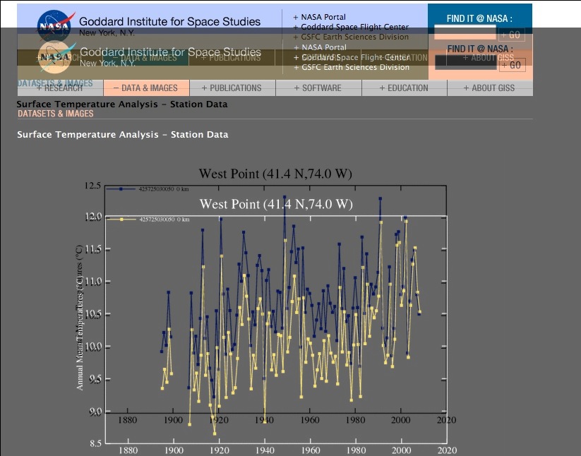
The light colored lines are the ‘adjustments’, the blue lines are the original data. Two things jump out on this result:
- The temperature scale as been dropped a magical 0.5°C (y-axis on left) in the ‘adjusted’ data.
- The last few years of temps are used in both data sets – another version of “Mike’s (Mann’s) Trick” of using unprocessed sensor data to give the impression of warming.
GISS pushed down the earlier temperature record to make it look like it was cooler than today, when in fact there has been no significant change over the entire record. Â The adjustments are clear as day, as is the growing mountain of evidence that the raw temperature record is proving one of the two climate model predictions right.
As I noted in this post, the alarmists have no choice but to rig the raw data if their theory of man-made global warming is to survive. In that post I noted how the raw data from another similar analysis maps directly with the IPCC’s vaunted climate models when they turn OFF man-made global warming. Here is the overlay graph again (click to enlarge):
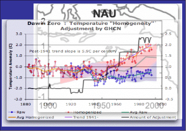
That reddish band in the background is the IPCC climate model predictions with a man-made warming component. The blue band (which turns purple when the red and blue overlap) is the IPCC climate model predictions with no man-made warming.
The graph on top is the analysis of Darwin Station in Australia. Coincidentally the blue dots and lines are the raw station data – and they follow the blue band of the IPCC model predictions. The red dots and land are the post processed GISS data, which magically (and I am sure purely coincidentally) follow the IPCC model outputs that include man-made global warming (or AGW).
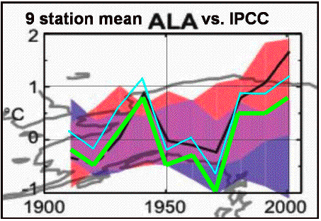
Here is another case of the raw temp dating manipulation from Alaska. I provided an update of the overlay graph for the person who did this analysis since they did not line up the y-axis correctly (green lines are my corrections, blue were in the original). Same result:
I saw the same thing in South America – seems this is breaking out all over the globe.
Now if you are going to prove a model is accurate, you compare it to reality and see if it lines up. Sadly for the IPCC and their models, reality keeps lining up with their model predictions that have man-made global warming turned off.
You cannot adjust the raw temps to map to your desired conclusion and then declare the models have been validated. But that is exactly what the cadre of conniving IPCC alarmists have been doing – while too many other scientists, journalists and politicians blindly went along for the ride. I now understand why the alarmists resisted freedom of information requests and were even willing to destroy data before handing it over. Their statistical facade is thin and easily pulled away from the public’s eye.
The unprocessed land temp record shows no AGW. Only after questionable ‘adjustments’ by the very people whose reputations and careers are on the line if AGW is disproved do we see a record that supports AGW theories. That is not science.
Update: Given these shenanigans is it any wonder the public belief in AGW is dropping as the news spreads? Â – end update
Text to Excel: The quickest way to turn a text file of numbers into data cells in Excel is to first paste the data into Word. Then select all the data (try not to include blank lines in front or back) and convert the text to table. The data from one column will fall across 2-3 columns, don’t panic! Copy the 2-3 columns of data from Word and past it into Excel. Then just sum the columns into another column (there should be only one value in any of the columns). At that point you have a single column of data in Excel.
Overlaying graphs: I use Powerpoint to overlay the data graphs. I copy them from their source as an image, and then paste them in Powerpoint. If you double click the image then you can make them transparent in order to lay them on top of another image.


[…] This post was mentioned on Twitter by Le Combat and AJ Strata, Palin Twibe. Palin Twibe said: http://tinyurl.com/yhkbcar You, Too, can help save humanity from AGW #cop15 #climate #green #IYCM #eco […]
Thanks for the mention, but more importantly, you are exactly right, first we need average joes like me to kick up the dust and we need smarter people like you to confirm our suspicions.
For instance, another blogger left a comment on my blog with this link: http://thedogatemydata.blogspot.com/2009/12/raw-v-adjusted-ghcn-data.html —where he has a nifty animated graph of raw vs processed temps at the Brisbane airport.
Much cooler than my crappy graph, it shows the same thing. Adjusted temps are pushed down pre-1978, which of course makes it look like Brisbane is warming.
AJ, now the question is, once more and more of us produce these graphs, who do we give them to to make a difference?
My bluedog Democrat Steve Driehaus is a true AGW believer–he voted for cap and trade, and last Friday, a local radio host asked him about “Climategate” and he said he hadn’t heard of it.
And of course Sherrod Brown, our Senator is even more of a true believer.
So, I ask, how do we get this beyond the conservative blogoshere?
How, indeed.
I live in the land of Pixie Dust, where hundreds of millions of state dollars are being spent on further Pixie Dust investments.
.
[…] You Too Can Help Save Humanity From AGW […]
Looking for Global Warming in Cincinnati…
From GISS, we once again get to compare the yearly data based on raw temperatures versus the homogenized data put through the statistical wringer.
Here’s another one of my subpar superimposed charts. The blue line represents the yearly temps bas…
AJ,
Did the comparison between the raw/homogenized data for my hometown, Cincinnati and it showed the same thing.
The homogenized data deflated the warm period between 1930 to 1950 and left the post 1980 temperatures pretty much untouched.
As a result, the post 1980 temperatures have no counterpart in the historical record when the data is manipulated.
Of course the raw temperatures show that the post 1980 is now warmer than the 1930-1950 period.
Are they fitting the data to their theory or are we missing something?
the link for the Cincy graph is here: http://thevirtuousrepublic.com/?p=4828
I once attended a seminar given by a guy who was a expert in radio communications. During a break, he told us a story about how he had developed a burst transmitter design for an agency within the “intelligence community”. In the process, he described how not only did this intelligence agency have guys designing radio transmitters that could be hidden, they had another set of guys, a “counter group,” who’s job it was to detect hidden radio transmitters. These two groups would go after each other in an attempt to come up with the best possible transmitters and the best possible methods of detection.
In climate science, we have a bunch of seemingly half drunken academics who live off the government dole while they concoct amateurish schemes to prove something that it seems has been predetermined to be true, no matter the actual empiric data. The only group of guys trying to test their schemes are underfunded or doing work on their own time, pro-bono.
This process is obviously corrupt. It was never meant to provide the truth. If it was, the government research community would also have a fully funded “counter group” to try to prove that “Anthropogenic Global Warming” doesn’t exist, has little impact or at least can be easily mitigated and therefore save billions, if not trillions, of dollars/Euros/pounds on trying to prevent a non sequitur. Afterall, who in their right mind starts with the most expensive possible plan and seems to make no attempt to mitigate costs.
The fact that there is no “counter group” immediately brings into question the purpose of the activity and whether it is meant to be part of that “waste, fraud and abuse” that so often infiltrates all vestiges of government. The fact that this is an international activity makes one wonder if the UN has any real function except to give heads of state a chance to go shopping in New York City from time to time and travel to useless conferences where they can dine well and come up with new ideas on how to fleece their citizens at home.