Search Results for "1930"

Feb 26 2010

The Walls Of Anthropogenic Warming Come Crashing Down

Published by under All General Discussions

Addendum: Folks, I had to rush this out this morning so I could make a meeting. With a few minutes available I am editing and expanding this a bit, adding links, etc  – end addendum

The science of AGW (man-made global warming) is not only unsettled, it is systematically being debunked by more careful and rigorous application of statistics and math to the challenges of modeling the Earth’s climate. The foundation of this modeling is representing the period between 1880 and the present, where there is some pool of measurements around the globe. A pool that was sparse with huge uncertainties in the past (thus providing for errors and focus on measuring temps inside human enclaves) and which grew in scope, and then 20-30 years ago the number of actual measurements suddenly dropped off. This foundation is required as the point of departure for all longer term assessments, and must be right before we can make assumptions to temperatures prior to this period of record.

When graphing some data from a preeminent skeptic (E.M. Smith) I generated an interesting graph about global temperature indexes and number of stations:

Note: Red is stations in thousands, yellow is 1 standard deviation (normal variance). Black is the trend and blue is the measurement of change since 1880. The green line notes when the number of station measurements started dropping off mysteriously.

I noted then that the data shows the distinct possibility that global temperature cooled as thermometers actually spread outside major cities, along with technology. Instead of just taking measurements in and around human enclaves, as a result of WWII and the Cold War we saw weather stations proliferate into rural urban areas across the globe. It seems pretty clear the expansion of measurements could honestly be a cause for some of the cooling seen in the last century, prior to the deletion of thousands of measurement sites from the estimates of the global temperature index.

A new study out adds another piece to this puzzling change in measurement points (which includes removing all measurements from the country of Bolivia 20 years ago, even though the data is still available). This study shows how ‘adjustments’ to raw data have actually spread the phenomena of Urban Heat Island effects out to sparsely populated regions. Here are the main graphs, first with the raw data showing urban and rural temperature trends across the US:

In this diagram the pink data is urban sensors where the Heat Island effect can clearly be seen as populations grew in density and radius. Blue is the rural ‘reference’  trend without large human enclaves. Note the warming trend in the 1930-1950 period, which is +0.4° C for both rural and urban sensors. In the current warm period the rural measurements are in the exact same range, but the urban measurements have grown 0.4°C – and in only in the last 30 years (when the number of measurements dropped away suspiciously). This is UHI.

The rural regions are only the regions where CO2 driven warming would clearly show up, outside the effects of forces from large population centers. This is very important and just not emphasized enough in the paper (scientist are very neutral in their wording, many times to neutral). If there was an impact on global warming coming from CO2 and Green House Gases (GHG), it would show up in rural locations and not be mixed or drowned out by UHI. Many AGW alarmists, Phil Jones of CRU specifically, have claimed there is no measurable UHI – but  this study clearly shows there is one hidden in the RAW data controlled by the NCDC.

The NCDC clearly ALTERS the raw data – and this ‘adjusted’ data is what is provided to other researchers. This ‘adjusted’ data is wrong as can be seen in the post-adjustment graph:

What we see is an alteration of the rural ‘reference’ data to match the UHI effected data! The claim is that this ‘adjustment’ does just the opposite. It is supposed to cool down measurements from large human enclaves and REMOVE the UHI effect. As anyone (even Al Gore!) can see this claim is 180° wrong. The rural data has been ‘adjusted’ (more like infected) with the  UHI effect.

In the second graph the 1930-1950 warm period has been cooled by 0.2°C and the current period has been warmed 0.6°C! This clearly is not how to remove UHI. You don’t warm the none UHI effected areas to match the UHI effected areas. Is this pathetically shoddy math or another trick to hide the decline? Only time and serious investigation will tell. Whatever the source of the problem is it is universal, as many have discovered independently around the world.

The paper just about destroys the AGW theory. It shows that the UHI effect indeed exists and is out there in the raw data. But moreover, it demonstrates that there cannot be any CO2 or GHG driven warming because it is not showing up in the rural sites, away from the UHI effects. Finally, it shows what a bunch of incompetent people have been involved in developing the AGW foundations. In an attempt to cool UHI effects they did just the opposite.

We now know the UHI effect ‘disappeared’ because someone erroneously spread the UHI data over the rural reference data – creating a false image of warming and covering up the evidence against CO2 or GHG warming. What really is a crime is that no one in the AGW camp thought to do this simple validation check between the raw and ‘adjusted’ data This error is simple, obvious and demonstrates lack of quality at best.
10 responses so far

Feb 11 2010

The Mythical Global Warming

Update Alert: New graphs up, updating text now. – new text is in red, silly mistaken old text is in strike out. Sorry for the lousy quality control, there is a reason I am not paid to do this! The fixes made my case stronger I think.

Update Alert: I have errors in the last four graphs (global averages) which I will fix as soon as I can. Sadly this one person shop is juggling too much right now – my bad. It only changes the magnitude of the results, not the contours. Now if I can keep MS Excel from bombing again! – end alert

There’s a very interesting post up at Musings by Chiefio, which focuses on actual temperature measurements and what they are saying about global climate over the last 130 years of the basic temperature record. Chiefio (sorry, should know the real name) and I share a severe skepticism about the global climate indexes since they are 99.99+% extrapolations and adjustments – not measurements! Only .01% of the data are measurements, and even then the alarmists do all sorts of unproven processing on the raw values.

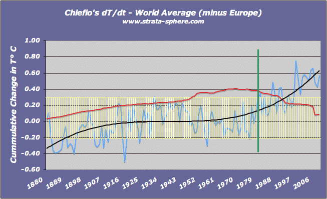
What I appreciate Chiefio doing here is just staying with the basic data and asking a basic question – what was the accumulated change in Temp over time (what he calls dT/dt).  He posted his data and did some graphs, but I wanted to do my own look at his results and did my own graphs of the data – hopefully Chiefio will not mind.

As far as I know Chiefio was using the raw data from GHCN, which is the basic data for GISS, CRU and NCDC before they do all their special ‘adjustments’. So here are the regional results in my own format with some additional information added.

Continue Reading »

16 responses so far

Jan 21 2010

Stunning: NASA GISS Admits No Evidence of AGW In The US, Won’t Be For Decades!

It is amazing what you find when you pull back the PR spin from public facade of the AGW crowd and they become honest about the global warming canard. In my previous post I discovered Jim Hansen of NASA GISS noting the US temperature data is so noisy (yet it is the most accurate, most measured in the world) that you cannot pull any conclusions from it, and basically the 1930’s and 2000’s are statistically the same temperature!

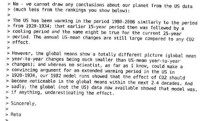
I thought that was a pretty stunning admission. Until I read further into the email trail up and Judicial Watch (page 71 of 215) and discovered this from August 15, 2007 (click to enlarge)

The email is from Reto Ruedy at GISS, one of Hansen’s top analysts. It is a headline worthy admission. There is no evidence of CO2 driven global warming in any of the US temp data – even though we are accused of being the CO2 generating capitol of the world. What’s more, they do not expect to see any evidence of AGW in the US for 2-4 more decades! I think we could afford to wait a little longer to see if this theory holds up.

And yet, without ANY evidence of AGW active in the US, Americans are supposed to cripple our economy and shell out billions in tax dollars? How could AGW be evident everywhere else but not here in the great CO2 producing center of all human kind? These “NASA” scientists are admitting they have never yet measured any global warming in the US outside natural causes.

Stop the Presses!

27 responses so far

Jan 21 2010

NASA GISS Admits Current Temps Not Historically Warmer

Major Update: This is a quote from Reto Ruedy Jim Hansen on August 10, 2007 regarding the US GISS temp data:

He [McCyntire] concentrates on the US time series which (US covering less than 2% of the world) is so noisy and has such a large margin of error that no conclusions can be drawn from it at this point.

Excuse me? The US has the most complete coverage and the most accurate sensors out there, and it is too noisy to make any historic conclusions from? This is headline news! Go to page 36 in the pdf linked below to find this little confession.

Clarification: the admission that the US data is ‘noisy’ does come originally from Hansen, and is expanded by Reto. So it is a Hansen confession. – end update

Steve McCyntire noted that Judicial Watch had acquired and released a series of emails regarding the adjustments NASA GISS made to the US temp record due to some missed corrections. In their snobbish and arrogant effort to belittle those asking questions about what was the warmest year on record, they inadvertently admitted that the current warm period is not significantly greater than the warm spots seen in the US in the 1930’s and 1950’s.

The admission is found in a tidbit in one email, where GISS admits their standard deviation is 0.47°C (which begs the question about any warming trend measured at 0.8°C).  What this means is the years, 1934, 1998, 1921, 2006, 1931, 1999, 1953, 1990, 1938 and 1939 (the top 10 ‘warmest’ years in America) are all statistically the same ‘warmth’. They all fall within the GISSN claimed standard deviation.

Which begs the question about this chart:

It would seem to me that if these years are all statistically equivalent, then today’s temps are no different than those seen in the 1930’s.  More fun with numbers.

10 responses so far

Jan 02 2010

Man-Made Global Warming Was Biggest Con Of The Last Century

One thing 2009 will be remembered for is it will be the year the man-made global warming con finally fell apart. It will be partially due to the shoddy ‘science’ used (and abused) to promote the con. It will be partially due to the realization that the con was being run by people with financial ties to green corporations who were trying to control the entire energy segment of the world. Bernie Maddoff was an amateur in comparison. It will also be due in part to the illuminating emails and data made public in what is called Climategate.

But all of these factors are really only making headway because of the main underlying factor destroying the myth of man-made global warming: the raw data.

The premise behind man-made global warming is this:

  • CO2 is a green house gas – which magically and whiteout a scientific proof over powers all other climate and temperature factors, like that huge nuclear furnace at the center of our solar system and water vapor which makes up 90-95% of the green houses gases.
  • Since industrialization and the population explosion, humankind as been pumping vast amounts of CO2 into the air – over powering sources of CO2 like volcanoes, animal by products, etc.
  • The result has been out of control, never before seen, global warming.

This last part is not true of course, since the 1930’s and 1940’s were just as warm as the 2000’s, most of the Earth’s heat records are from the 1930’s, the warmest year on record is from the 1930’s, and the MWP was as warm or warmer than today.

While most skeptics (we heretics of the Church of Al Gore/IPCC) have been able to destroy the 3rd leg of this ‘theory’ (or is that theology?), the fact is data is out now destroying the first two assumptions as well.

A recent scientific report notes that there has been – wait for it – no significant increase in CO2 levels over the last 160 years:

Most of the carbon dioxide emitted by human activity does not remain in the atmosphere, but is instead absorbed by the oceans and terrestrial ecosystems. In fact, only about 45 percent of emitted carbon dioxide stays in the atmosphere.

To assess whether the airborne fraction is indeed increasing, Wolfgang Knorr of the Department of Earth Sciences at the University of Bristol reanalyzed available atmospheric carbon dioxide and emissions data since 1850 and considers the uncertainties in the data.
In contradiction to some recent studies, he finds that the airborne fraction of carbon dioxide has not increased either during the past 150 years or during the most recent five decades.

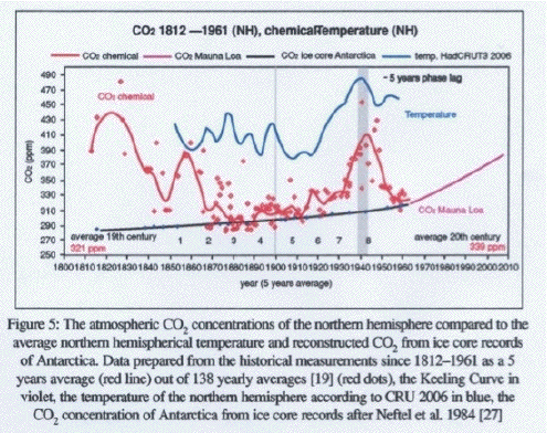
This is not the only data showing this to be true. Ice cores are wonderful records of the atmosphere, and are found all over the world. It is interesting to see this data then, which shows CO2 levels were higher in the early 1800’s than right now:

This is a lot of data on one graph, so let me direct your eyes to the key points. Basically follow the red dots, which are the yearly average CO2 levels in the atmosphere as measured in ice cores (what the graph calls ‘CO2 chemical’). As anyone can see the early 1800’s had years with higher CO2 levels than today, which began dropping as the industrial revolution took off. Strange? If you follow the red line (a 5 year average of the dots) we see the CO2 levels don’t really take off until the 1940’s – as global temperatures are already rising.

In fact, the CO2 is clearly lagging the temps, not leading it as it would if it was a driving factor.

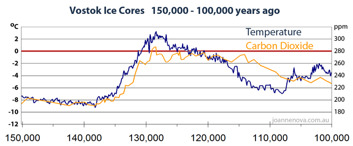
We see this again in the ice core record going back thousands of years (as I noted in this post). Over time the atmospheric CO2 response has typically lagged temperature increases, sometimes by as much as 800 years! Clearly this contradicts assumptions 1 and 2 in the theory of man-made global warming.

This lag time is conveniently covered up by the high priests of AGW by compressing the time scale of these ice core graphs to make it appear as if the CO2 and temperature are completely in sync (refer to the linked post). The fact is the more truly global data we get, the more man-made global warming disappears in a poof of accuracy.

WUWT ran an interesting graphical comparison between IPCC/GISS global estimates and highly accurate satellite data which really illustrates this. The IPCC/GISS data are ‘estimates’ because the data set shown is really derived from sparse measurements made by temperature stations of dubious precision spread across the globe. To create a world map they estimate what the data in the holes will look like, basically making up 99% of the data (trust me, much less than 1% of the Earth’s surface is directly measured by sensors). Here is that guesstimated graph from WUWT:

As I said, 99+ % of that graph is estimated based on unproven and unverified extrapolations and ‘corrections’ which the AGW high priests use to create the impression of run away warming. Look at all the red areas and so little blue. White is neutral and seems to be the minority.

The satellite data, while not as long a record, is incredibly accurate and detailed. You have one type of sensor taking the same measurement thousands of times over the Earth each day. There is no guesstimating holes here. And of course that picture for the last 10 years shows a completely different story:

Now look at the amount of red versus white versus blue, and the intensity of the red and blue. The blue dominates, with white coming in second. Antartica (which is a continent estimated using something ridiculous like 10 ground stations) looks dark red in the upper chart, but is a mild pink in the satellite record. Sort of explains why the Antarctic sea ice extent has been growing over the last 3 decades instead of shrinking – as the dark red bands would imply.

Look at how much white and blue exists verses red. The satellite data clearly shows a cooling planet over the last decade. Also marvel at the detailed measurements. The coverage of the satellite data is 100% over land in this case. If you add in those satellites that derive Sea Surface Temperatures I would wager it would look very similar – more cooling than warming.

The top graph reminds me of a paint by numbers picture, crude and imprecise. The 2nd one illustrates real modern science. It also proves the biggest con of the last century was man made global warming.

Just as this latest reversal from the UK Met office illustrates:

Britain is bracing itself for one of the coldest winters for a century with temperatures hitting minus 16 degrees Celsius, forecasters have warned.

“The cold weather comes despite the Met Office’s long range forecast, published, in October, of a mild winter. That followed it’s earlier inaccurate prediction of a “barbecue summer”, which then saw heavy rainfall and the wettest July for almost 100 years.”

Yep – coldest winter in a century. Therefore  CO2 cannot over power all those other climate factors as claimed.

BTW once the cold snap breaks we shall see another nail in the coffin of CO2, because NASA satellites are poised to disprove a critical segment in the CO2 driven warming theories:

New measurements from a NASA satellite show a dramatic cooling in the upper atmosphere that correlates with the declining phase of the current solar cycle.

The TIMED measurements show a decrease in the amount of ultraviolet radiation emitted by the Sun. In addition, the amount of infrared radiation emitted from the upper atmosphere by nitric oxide molecules has decreased by nearly a factor of 10 since early 2002. These observations imply that the upper atmosphere has cooled substantially since then. The research team expects the atmosphere to heat up again as solar activity starts to pick up in the next year.

The SABER dataset is the first global, long-term, and continuous record of the Nitric oxide (NO) and Carbon dioxide (CO2) emissions from the thermosphere.

A fundamental prediction of climate change theory is that upper atmosphere will cool in response to greenhouse gases in the troposphere,” says Mlynczak. “Scientists need to validate that theory. This climate record of the upper atmosphere is our first chance to have the other side of the equation.”

Recall the theory here. CO2 acts as a shield, holding heat in which cannot reach the troposphere and radiate out to space. It means we better not see the troposphere warming when the next solar cycle kicks in (and it is already beginning to rumble back to life). If increased solar activity results in increased tropospheric radiation, that will spell the end of the CO2 driven climate argument. It is a bust if that happens.

And we should see that result showing up this summer – just in time for the 2010 elections. History can be so ironic in its timing.

BTW, stop by and read this excellent summary at Powerline.

4 responses so far

Dec 19 2009

The Main Reasons AGW Is Pure Science Fiction

One of the interesting things about Climategate is how it has really exposed the pathetic math behind the hypothesis of man-made global warming. Sadly, a lot of us assumed the PhD proponents of global warming were performing sound science based on solid mathematics and statistics. But as more and more professional eyes have reviewed the assumptions and calculations behind the AGW hypothesis, the more it is becoming clear AGW is actually science fiction, not science fact.

To summarize: there are numerous egregious mistakes being made in the calculation of a global temperature index, mistakes in the extension of the current index back in time using older (less accurate) records and proxies, and downright misleading displays of information which hide the reality of global climate behind the science fiction of AGW.

I am going to attempt outline the key evidence that now exists that shows AGW is fiction, not fact. This will not be short.

Continue Reading »

17 responses so far

Dec 05 2009

Climategate Forces UK Review Of Warming Data & Results

Climategate is not going away. As I noted in my previous post this is not about emails where so called scientists suborning the peer-review process and scientific method while colluding to side step legal freedom of information requests. No, the problems discovered in Climategate are in the code and data and uncertainties.

When professionals who are versed in science, engineering and math, and the quality requirements normally imposed upon us in our careers (mine being space and defense systems), review the crap that is the basis for global warming hysteria we all see the problem crystal clear. The alarmists were hiding their data and processes for good reason.

I am confident in this because of what just happened in Europe. Not only did the cocky IPCC chair have to come out and do a 180° (not C there slick) political U-turn and support an investigation. The UK Met Office has decided to redo all the global warming assessments, computations, etc. since the CRU leak exposed the current conclusions to be based on shoddy work.

The Met Office plans to re-examine 160 years of temperature data after admitting that public confidence in the science on man-made global warming has been shattered by leaked e-mails.

The new analysis of the data will take three years, meaning that the Met Office will not be able to state with absolute confidence the extent of the warming trend until the end of 2012.

The Met Office’s published data showing a warming trend draws heavily on CRU analysis. CRU supplied all the land temperature data to the Met Office, which added this to its own analysis of sea temperature data.

Since the stolen e-mails were published, the chief executive of the Met Office has written to national meteorological offices in 188 countries asking their permission to release the raw data that they collected from their weather stations.

The Met Office is confident that its analysis will eventually be shown to be correct. However, it says it wants to create a new and fully open method of analysing temperature data.

You don’t invest 3 years rechecking into a supposed emergency unless the picture is really that bad. It is really that bad.

Since the ‘raw’ land sensor data shows the Earth today is very similar to the 1930’s and 1940’s, and since there really was an MWP shown in hundreds of sites in many, many peer reviewed papers I suspect the review is going to put the final nail in the AGW scam.

2 responses so far

Dec 04 2009

UN Decides Climategate Is Serious

Published by under All General Discussions

Well, well, well – it seems the UN IPCC has realized Climategate is serious and could ruin the reputations of thousands of scientists, politicians and journalists who fell down on their responsibility to verify the claims of data cookers at CRU, Penn State, NASA GIS and possibly elsewhere (UCAR/NCAR comes to mind).

Dr Rajendra Pachauri, head of the Intergovernmental Panel on Climate Change (IPCC), said the matter could not be swept “under the carpet”.

Dr Pachauri told BBC Radio 4’s The Report programme that the claims were serious and he wants them investigated.

“We will certainly go into the whole lot and then we will take a position on it,” he said.

“We certainly don’t want to brush anything under the carpet. This is a serious issue and we will look into it in detail.”

Sounds, er – serious. And it is. There is a lot of hard evidence in the CRU data dump, evidence in code and data that put the email discussions about suborning the scientific method, the peer-review process and the legal requirements of FOIAs into criminal context.

For example:

  • There is in-line code which hides the warm period in the 1930’s and 1940’s while elevating the recent temps to cover up the fact today’s climate is basically the same as that period – which had much lower atmospheric CO2 levels:

Climategate Escalating, Smoking Gun Could Be 1940’s ‘Blip’

The AGW Cover Up Is In The Code – Smoking Gun Update!

Climategate: The Smoking Code

How To Hide Global Cooling: Delete The “1940’s Blip”

NASA GISS Did Hide 1940’s Blip

  • There is clear evidence that Phil Jones lied to the world in August when he said the original CRU data was lost in the 1980’s and not available for FOIA requests:

Proof CRU Did Not Lose Their Raw Station Data

CRU’s Jones Supposedly Lost Data Used In 2008

More Evidence CRU Has Raw Temp Data & It Shows No AGW

These two scandals – hiding the fact current temps are not much different from nearly 70 years ago and trying to claim the raw data was destroyed two decades ago – are  more than enough evidence to call into question the entire AGW theory. The IPCC should be worried, there house of cards is now standing on very shaky ground.

And that is before we even get to simply and reasonable scientific challenges to the global temperature index, the foundation for the entire AGW theory, such as the question of the uncertainty and error in the data and processing steps, and therefore also inside alarmists’ conclusions:

CRU Raw Temp Data Shows No Significant Warming Over Most Of The World

The One Place On Earth Runaway Warming Should Be Obvious

Alarmists Hide Truth About (Lack Of) Global Warming

Global Temperature Reality Is Inside The Error Bars

And the general question of how the flat historic temps turn into rampant warming through magical statistical processes only the warmists know about:

Where Does Global Warming Actually Come From?

Wow, CRU Admits Little Evidence Of Recent Warming

Another AGW Smoking Gun

And there is also that professional problem of dealing with crappy code producing results that are not verified or defensible.

The World’s Future Hangs On “OH F–K THIS”!

The End Of The Earth Is Coming, But Scientists Cannot Write Professional Quality SW!

CRU Code & Data A Disaster

It seems to me some serious people started looking closely at what the blogosphere was turning up and realized this is not a flash in the pan joke or PR game. This IS serious.

Update: And how could I forget the snake oil (tree rings) used to try and hide the settled science regarding the Medieval Warming Period!

Fraudulent hockey sticks and hidden data

3 responses so far

Dec 03 2009

NASA GISS Did Hide 1940’s Blip

In a follow up to my previous post regarding how the cover up of the warm period seen globally in the 1930’s -1940’s is probably the best documented, easiest to grasp case of falsifying raw data to create the myth of runaway global warming (and thus man-made  global warming) we have some news with a reminder that NASA’s GISS was already caught once trying to hide the blip:

Chris Horner, a senior fellow at the Competitive Enterprise Institute, said NASA has refused for two years to provide information under the Freedom of Information Act that would show how the agency has shaped its climate data and would explain why the agency has repeatedly had to correct its data going as far back as the 1930s.

“I assume that what is there is highly damaging,” Mr. Horner said. “These guys are quite clearly bound and determined not to reveal their internal discussions about this.”

The numbers matter. Under pressure in 2007, NASA recalculated its data and found that 1934, not 1998, was the hottest year in its records for the contiguous 48 states. NASA later changed that data again, and now 1998 and 2006 are tied for first, with 1934 slightly cooler.

That blip is a real problem for the IPCC and other alarmists. It shows the Earth was just as warm as it is today, with much lower CO2 levels. GISS cannot hide the data or code, it is publicly owned since it was created on the taxpayer’s dime. We own it – not some zealot scientists.

One response so far

Dec 03 2009

Climategate Escalating, Smoking Gun Could Be 1940’s ‘Blip’

A blog at CBS News, a news organization hardly unfriendly to liberal causes and climate alarmists, produced a very harsh report on climategate today:

Ripples created by the disclosure of global warming files now being called “ClimateGate” continue to spread, with congressional attention growing and the head of a prominent climate change group stepping aside.

The reverberations have extended beyond the campus of the University of East Anglia and the CRU. E-mail messages from Michael Mann, a professor in the meteorology department at Penn State University who has argued that mankind is threatening “entire ecosystems with extinction in the decades ahead if we continue to burn fossil fuels at current rates,” appeared in the leaked files. Now Penn State has opened an investigation into Mann’s work, and the U.K.’s weather agency has been forced on the defensive as well.

Some mainstream academics working in the area have distanced themselves from Mann, Jones, and other researchers whose correspondence has drawn allegations of impropriety. Aynsley Kellow, a professor at the University of Tasmania who was an expert reviewer for a U.N. global warming report, told ABC Radio there was evidence of a “willingness to manipulate raw data to suit predetermined results, you’ve got a resistance to any notion of transparency, an active resistance to freedom of information requests or quite reasonable requests from scientists to have a look at data so that it can be verified.”

Hans von Storch, director of the Director of Institute for Coastal Research who was assailed by Mann in one e-mail message, calls the CRU axis a “cartel” and suggests that Jones and others avoid reviewing papers. A colleague, Eduardo Zorita, went further and said Mann and his allies “should be barred” from future United Nations proceedings and warned that “the scientific debate has been in many instances hijacked to advance other agendas.”

Sounds like a post from Air Vent or WUWT, not from the home of 60 Minutes. But I think this is just an early indication on how far this scandal could blow.

Another article at Reason touches on what could be the most damning email, which highlights easily demonstrable data manipulation by Jones and some US cohorts. The topic of fraud was how to hide the infamous 1930-40 warm period, which equals todays warm period:

Consider researcher Tom Wigley’s email describing his adjustments to mid-20th century global temperature data in order to lower an inconvenient warming “blip.” According to the global warming hypothesis, late 20th century man-made warming was supposed to be faster than earlier natural warming. But the data show rapid “natural” warming in the 1930s. Adjusting the 1940 temperature blip downward makes a better-looking trend line in support of the notion of rapidly accelerating man-made warming. Collecting and evaluating temperature data requires the exercise of scientific judgment, but Wigley’s emails suggest a convenient correction of 0.15 degree Celsius that fits the man-made global warming hypothesis. The adjustment may be reasonable—changes in instrumentation might need to be accounted for—but all raw data and the methodologies used to adjust them should be publicly available so others can check them to make sure.

From the email itself we discover the details on the conspiracy to fudge the data to fit the alarmists hypothesis:

Here are some speculations on correcting SSTs [AJSTrata: Sea Surface Temperarutes] to partly explain the 1940s warming blip.

If you look at the attached plot you will see that the land also shows the 1940s blip (as I’m sure you know).

So, if we could reduce the ocean blip by, say, 0.15 degC, then this would be significant for the global mean — but we’d still have to explain the land blip.

It would be good to remove at least part of the 1940s blip, but we are still left with “why the blip”.

This ‘blip’ is easily seen in many of the CRU data runs from 2005 and 2008 which were made public by what some assume is a CRU insider with a conscience. These graphs show the raw ‘land’ blips, prior to data fudging. What Wigley is doing (ironic name, eh?) is making the mean Earth Temp in this period go down by pushing the ocean temps down significantly. This globally makes the current period look much warmer in comparison. Since the ocean represent 75% of the Earth’s surface this fudge factor is quiet weighty.

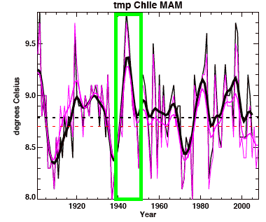
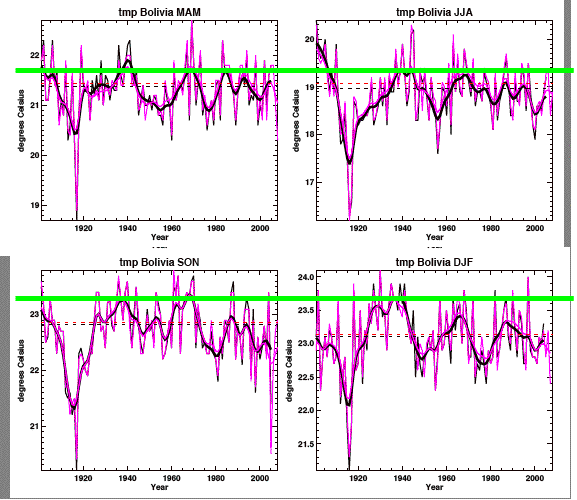
You can see the infamous blip in this CRU generated graph for Chile, March-April-May (MAM):

Notice how the 1940’s ‘blip’ dwarfs the current temperatures for the 2000’s, rising 0.6°C above today’s temperatures. Here are some others blips from Bolivia:

This email and these charts got me to wondering how bad the 1940’s blip was, which is why I went and looked at all the graphs and measured the pre-1960’s peak and compared them to the 2000’s peak – to see if there was actually a significant difference.

What I discovered surprised even me. Of all the countries graphed out in the CRU ‘raw’ data, 75% showed a peak-to-peak difference less than 0.5°C – which means they was no significant climate change for three quarters of the world’s land measurements. There are multiple reasons for 0.5°  to be a valid test of significance, but two of the most salient reasons are (1) the alarmists’ claim the Earth has experience 0.6° – 0.8°C or greater in the last 100 years and (2) ever since the Little Ice Age the Earth has been warming on average around the 0.5°C per century mark. I won’t even go into the issue of accuracy in the measurement data spanning 100 years.

Of the 25% which did show a temperature change outside this ‘normal’ range 6 countries (or 4%) showed significant cooling – not warming. Only 21% of the countries covered in the ‘pre-corrected’ CRU data showed significant warming. That means 79% of the land did not.

So how do you make charts that look like the CRU charts above look like this:

Wigley’s sea temp ‘adjustment’ could not do all the work, which is why the CRU code discovered that suppresses ground station (land) temps in the 1930’s and 1940’s while increasing current temps is one of those smoking guns no amount of misdirection and denial can bury.

Here’s the “fudge factor”:
yrloc=[1400,findgen(19)*5.+1904]

valadj=[0.,0.,0.,0.,0.,-0.1,-0.25,-0.3,0.,-0.1,0.3,0.8,1.2,1.7,2.5,2.6,2.6,2.6,2.6,2.6]*0.75 ; fudge factor

Wigley would seem to be target number 1 for investigating. His mails with plan to fudge + CRU Temp Graphs with blips clear blips + CRU code which adjusts the graphs with blips = one big climategate scandal.

Tom Wigley is an American working at UCAR, which means he will be investigated by Congress since UCAR and The National Science Foundation are up to their shoulders in IPCC and probably CRU.

13 responses so far

« Prev - Next »